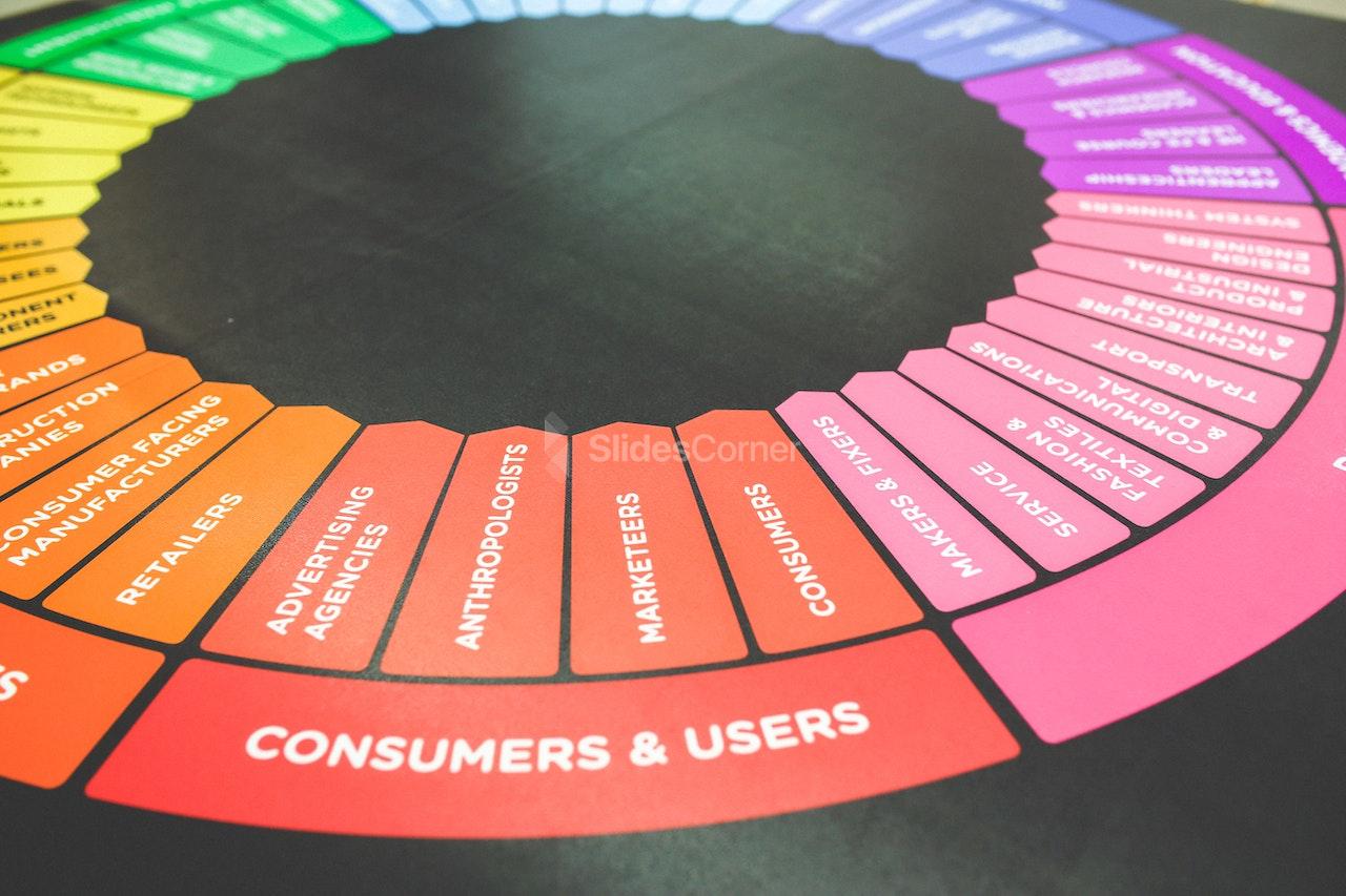
Discover how the psychology of colors in presentation design can influence emotions, boost engagement, and inspire your audience.
Colors are more than decoration—they are powerful psychological tools. In presentation design, the choice of color can define how your audience feels, remembers, and reacts to your message. Whether you use PowerPoint, Google Slides, or another platform, understanding the psychology of colors in presentation design is the difference between slides that fade away and slides that inspire action.
From trust-building blues to energetic reds, each color carries meaning. This article explores how you can harness color psychology to improve your slides and achieve maximum audience impact.
The Role of Color in Presentation Design
Why Colors Matter More Than You Think
When you design a presentation, your audience forms first impressions within seconds. Research shows that colors influence mood, attention span, and even decision-making. A neutral slide might look professional, but a slide designed with color psychology can actively guide emotions and responses.


The Connection Between Colors and Emotions
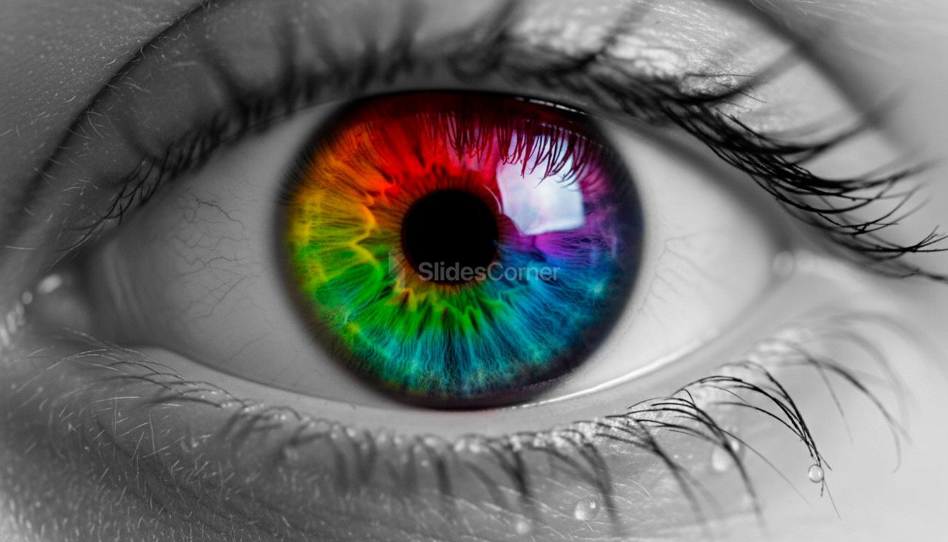
Every hue stimulates a different psychological reaction. Warm tones may energize, while cool tones tend to calm. A strategic use of colors in presentation design ensures that your slides not only communicate information but also create an emotional experience.
Understanding Color Psychology in Presentations
Red: Energy and Urgency
Red is bold, demanding attention and stimulating excitement. In presentations, it can highlight important data, evoke passion, or create urgency. However, overusing it may overwhelm your audience.


Blue: Trust and Professionalism
Blue is often linked to stability and credibility. That is why many corporate presentations rely on blue palettes—it makes audiences feel safe and confident in the message.


Green: Growth and Balance
Associated with nature and renewal, green communicates balance, health, and progress. It works well for presentations in wellness, sustainability, or finance.


Yellow: Optimism and Creativity
Yellow draws the eye and sparks imagination. A touch of yellow in slides can add energy and inspire creativity, but using too much risks causing visual fatigue.


Black and White: Simplicity and Contrast
Black conveys elegance and authority, while white emphasizes clarity and space. Together, they build contrast and allow key content to stand out.


Applying Color Psychology in Slide Design
Choosing a Cohesive Palette
Successful presentations do not rely on random color choices. Instead, they use a cohesive palette that aligns with the message. A healthcare presentation might lean on calming blues and greens, while a marketing pitch might use energetic oranges and reds.
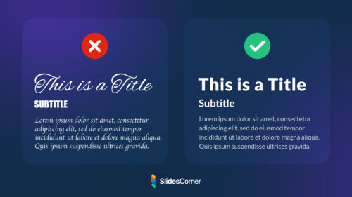
Balancing Colors for Readability
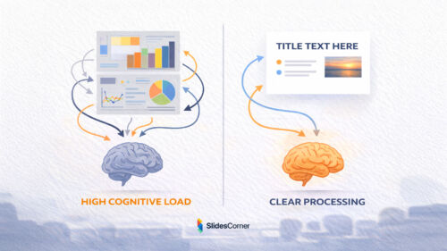
Readability is essential. Even the most meaningful color palette fails if the audience struggles to read text. Always ensure high contrast between background and text, and avoid clashing hues.
Aligning Colors with Brand Identity
If your presentation represents a company or personal brand, colors should reinforce that identity. Audiences remember consistent visuals, and color plays a central role in brand recognition.
Common Mistakes in Using Colors
❌ Overloading Slides with Bright Colors
Too many strong colors can confuse the audience. Limiting your palette ensures clarity and focus.
❌ Ignoring Audience Expectations
Cultural and contextual differences influence how colors are perceived. A color that communicates positivity in one culture may carry negative meaning in another.
❌ Forgetting Accessibility
Presentations should remain accessible to all audiences, including those with color vision deficiencies. Using texture, contrast, and icons alongside color ensures that meaning is not lost.
Real-World Impact of Color in Presentations
Successful presenters often share one trait: they understand their audience’s psychology. Colors can make statistics more persuasive, pitches more exciting, and lessons more memorable. The psychology of colors in presentation design is not abstract theory—it directly influences results.
Think of a fundraising presentation: a palette of green and blue inspires trust and growth, making donors more likely to contribute. Or consider a product launch: using red and orange amplifies urgency, encouraging faster decision-making.
Final Tips: Creating a Powerful Color Strategy
Color psychology in presentations is not about choosing a favorite shade—it is about aligning visuals with purpose. Test different combinations, consider the emotional journey of your audience, and keep design simple. With a thoughtful approach, your slides will not only inform but also inspire.
Key Takeaways
- Colors shape emotions and guide audience perception.
- Red creates urgency, blue builds trust, green symbolizes growth.
- Cohesive color palettes make presentations memorable.
- Balance readability and accessibility in every slide.
- Align color choices with audience expectations and cultural context.
What colors should I use for a business presentation?
Blue and gray are effective for trust and professionalism, but you can add accents of other colors depending on your message.
Can colors improve audience engagement?
Yes. Strategic use of color makes slides more memorable, engaging, and persuasive.
How many colors should a slide deck use?
A primary palette of 2–3 colors, plus 1–2 accent colors, is usually enough for clarity and balance.