Slideshows are quick to produce, easy to update and an effective way to inject visual interest into almost any presentation. However, slideshows can also spell disaster even for experienced presenters.
The key to success is to make certain your slideshow is a visual aid and not a visual distraction.
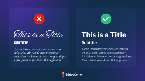
In the first instance, you should ideally use the slide master feature to create a consistent and simple design template. It’s okay to vary the presentation of your content (bullet list, two-column text, text and image, etc.), but be consistent with other elements like font, colors, and background.
It’s not surprising slides presentations have become the norm for visuals in most business presentations. Projected slides are a good medium for depicting an idea graphically or providing an overview. However, slideshows can also spell disaster even for experienced presenters. Slideshows are quick to produce, easy to update and effective to inject visual interest into the presentation.
Now we are going to list some situations that you should avoid at all costs to achieve a successful presentation.
1. Overload your slides
Simplicity is vital if you’re looking to reach a broad and diverse audience. Nothing is worse than being stuck watching a presentation that goes on and on that you hardly understand.
Try placing important points in bullet points. That way, your audience can identify the main takeaways instead of searching for them in a block of text. You want your presentation’s ideas to be accessible and easy to follow. As you prepare, ask yourself: what are the key points you want people to take away?
Simplify and limit the number of words on each screen. Use key phrases and include only essential information.
2. Heavy text blocks
Slides are a poor medium for detail and reading. Avoid paragraphs, quotations and even complete sentences. Limit your slides to five lines of text and use words and phrases to make your points. The audience will be able to digest and retain key points more easily. Don’t use your slides as speaker’s notes or to simply project an outline of your presentation.
3. Make a structure too simple
Imagine that you are a member of the audience and ask yourself what is the best order for your presentation. Make sure things are consistent and logical. To keep your presentation interesting, you may need to add more slides, cut out a section, or rearrange the presentation structure.

4. Too long presentation
Limit the number of slides. Presenters who constantly “flip” to the next slide are likely to lose their audience. A good rule of thumb is one slide per minute.
5. Not readable
If possible, view your slides on the screen you’ll be using for your presentation. Make sure the slides are readable from the back row seats. Text and graphic images should be large enough to read but not so large as to appear “loud.”
6. Not using visual aids
Try to incorporate photos or videos into your slides. Props can also help reinforce your words. Adding props doesn’t diminish your credibility or professionalism, but it does help illustrate your point when added correctly.
7. Old fashion style
Be aware of design techniques and trends. A few standard pointers to consider are:
- Don’t put blocks of text on a single slide
- Use a minimalistic background instead of a busy one
- Stick with muted or pastel shades
- Don’t read everything off the slide.
- Place only your main points on the screen. Then, explain them in detail. Keep the presentation stimulating and appealing without overwhelming your audience with bright colors or too much font.
Use contrasting colors for text and background. Light text on a dark background is best. Patterned backgrounds can reduce readability.
Use good-quality images that reinforce and complement your message. Ensure that your image maintains its impact and resolution when projected on a larger screen.

How to make a memorable presentation?
With these strategies, the audience will leave the room thinking positively about your work.
Here are some tips to keep your audience actively engaged as you’re presenting.
- Practice with someone who has never seen your presentation. Ask them for honest feedback about colors, content and any effects or graphic images you’ve included. Practice giving your speech in front of the bathroom mirror or your spouse or a friend. Take any feedback they give you and don’t feel discouraged if it’s critical or different than you expected. Feedback helps us continually improve. But remember, you can’t please everyone, and that’s fine.
- Do not read from your slides. The content of your slides is for the audience, not for the presenter. Take deep breaths. It’s better to go slow and take time to convey everything you need to instead of rushing and leaving your audience more confused.
- Do not speak to your slides. Many presenters face their presentation on screen rather than their audience.
- Do not apologize for anything in your presentation. If you believe something will be hard to read or understand, don’t use it.
- Telling stories or sharing an event from your life or another anecdote increases your relatability. It also makes the audience feel more comfortable and connected to you.
- Smile and make eye contact with the audience. This creates a connection between you and the audience and helps the space feel more intimate.
- Start strong. The beginning is what draws your target audience in. Start your presentation on a strong note. If things start out entertaining, it increases the chances of your presentation being well received.


