Discover the best free presentation backgrounds for 2026 and make your PowerPoint or Google Slides look truly professional.
In 2026, a presentation is no longer “just slides.” It is often your first impression, your pitch, your portfolio, and sometimes your only chance to stand out. Whether you’re presenting a startup idea, a marketing strategy, a school project, or a corporate report, the visual quality of your slides directly affects how your message is perceived.
The good news is that you no longer need expensive design software or paid templates to look professional. High-quality, free backgrounds for PowerPoint and Google Slides can transform even the simplest content into something that feels polished, modern, and trustworthy.
But not all free backgrounds are created equal. Some look outdated. Others are overloaded with decorations that distract from your message. The best ones in 2026 follow clear design principles: clarity, balance, adaptability, and emotional coherence.
This guide explores what makes a background truly “professional” today, how to choose the right style for your purpose, and how free resources can compete with premium templates when used correctly.
What “Professional” Means in Presentation Design Today
In the past, professional slides were often synonymous with corporate blue gradients and generic stock photos. In 2026, professionalism is defined less by formality and more by intention.
A professional background now communicates three things instantly:
- You respect your audience’s time.
- You understand visual hierarchy.
- You care about clarity.
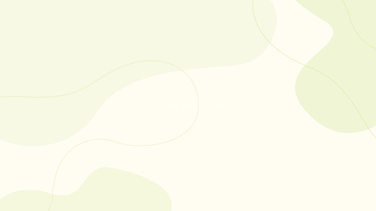
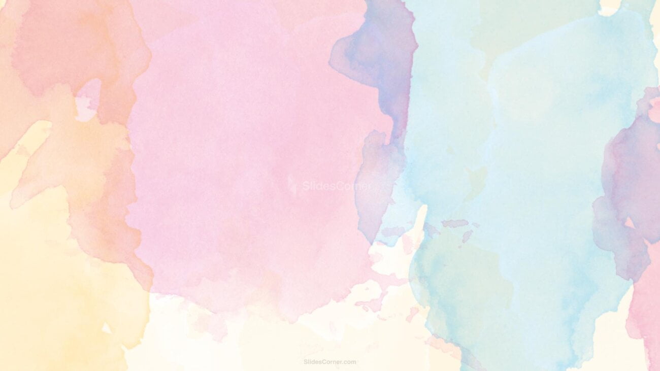
Modern professional slides are clean, readable, and purpose-driven. They don’t overwhelm. They guide the eye. They leave space for content to breathe. White space, soft gradients, subtle textures, and restrained color palettes dominate contemporary presentation design.
Free backgrounds that feel professional share a common trait: they are designed to support content, not compete with it. They act as a stage, not the main character.
This shift is why minimalist, abstract, and softly structured backgrounds are dominating in 2026. They work across industries, cultures, and screen sizes. They look good in boardrooms, classrooms, and Zoom calls alike.
Why Free Backgrounds Matter More Than Ever
Remote work, online learning, and digital pitching have normalized presentations across every field. More people than ever are creating slides, and most of them are not designers.
Free backgrounds democratize visual quality. They allow anyone to present ideas with confidence, even without technical design skills.
In 2026, the line between “free” and “premium” has blurred. Many free background libraries now offer designs that rival paid templates in terms of aesthetics and usability. The real difference is no longer price, but how well the background fits your message.
A well-chosen free background can elevate simple text into a structured narrative, make complex information easier to digest, increase perceived credibility, keep attention longer, and reduce cognitive load for the viewer.
Professional design is no longer about decoration. It’s about communication efficiency.
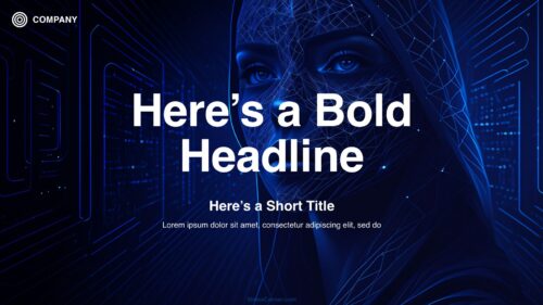
Business and Corporate Presentations
When credibility is the main goal
Business presentations in 2026 are expected to look calm, confident, and deliberate. Investors, managers, and clients subconsciously evaluate not just what you say, but how organized and reliable your slides feel.
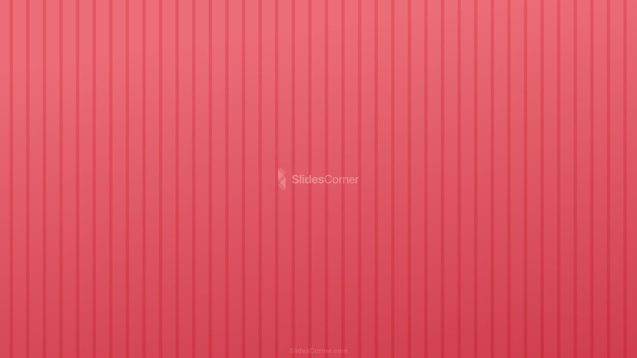
The best free backgrounds for corporate use rely on neutral or muted color palettes, soft gradients instead of hard contrasts, subtle geometric or linear patterns, and clear zones for titles and body text.
These designs convey order and stability. They reduce visual noise and keep focus on data, charts, and key messages.


A professional business background should never compete with numbers or headlines. It should frame them. In modern decks, the background often fades into near invisibility, yet its presence is felt through alignment, rhythm, and balance.
In 2026, dark-mode inspired backgrounds are also increasingly popular for corporate decks, especially in tech and finance. Deep blues, charcoal grays, and soft blacks with light typography feel modern and cinematic, particularly on large screens.
Education and Academic Use
Slides that help people learn
In classrooms and online courses, the background’s role is cognitive. It must help the brain focus.
Educational slides benefit from backgrounds that are light and airy, high in contrast for readability, visually calm, and consistent across slides.
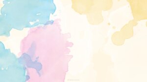
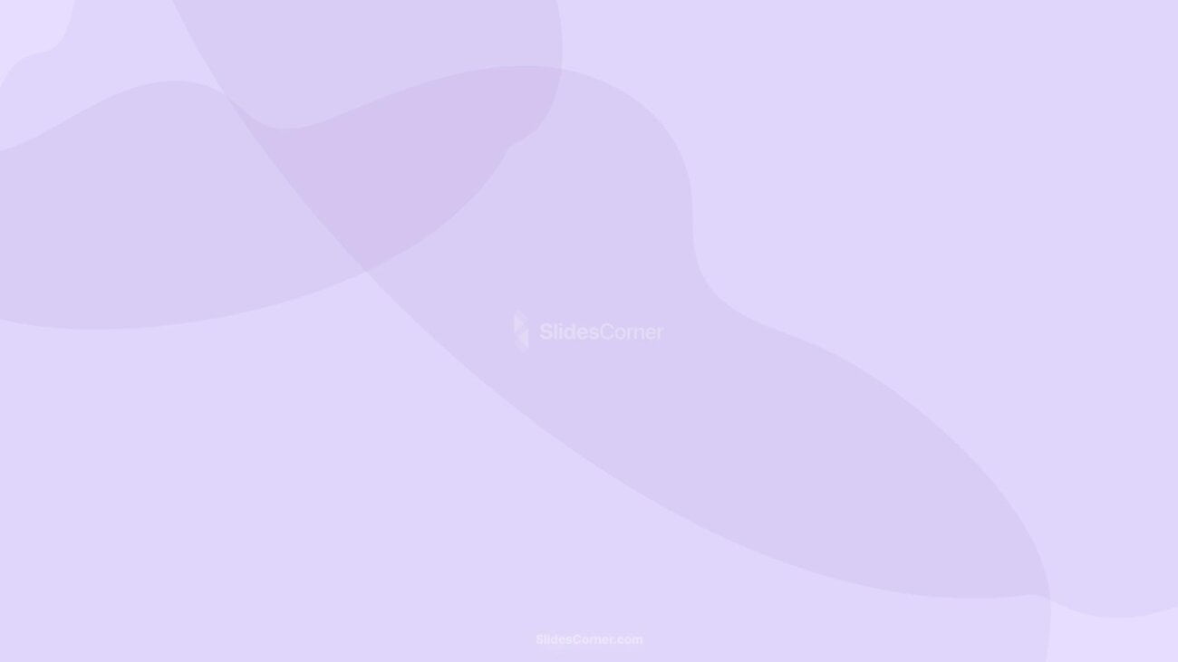
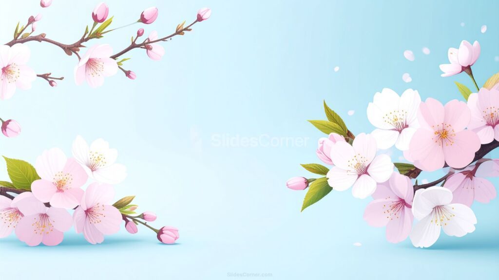
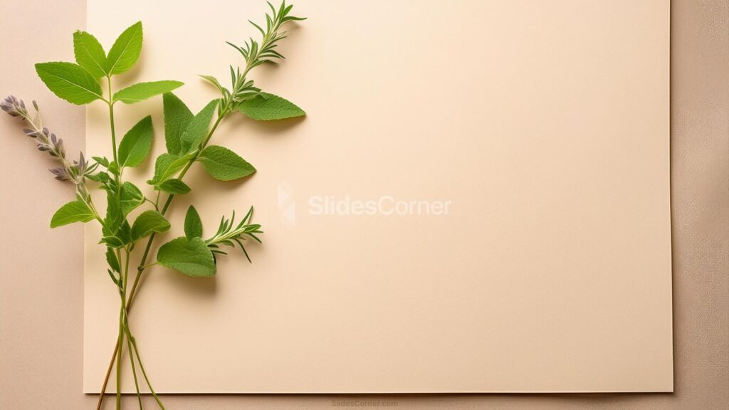
Free backgrounds designed for education in 2026 often use pastel tones, gentle textures, and soft organic shapes. These elements reduce fatigue during long sessions and make dense material feel more approachable.


Professional academic design avoids visual clutter. The background should never distract from diagrams, equations, or key terms. Instead, it should create a predictable visual environment where the learner knows where to look.
This is why modern educational backgrounds are increasingly modular. They provide subtle zones for headers, content blocks, and visual elements without forcing rigid layouts.
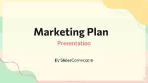
Marketing and Sales Presentations
Where emotion meets persuasion
Marketing decks live at the intersection of logic and emotion. They must inform and persuade at the same time.
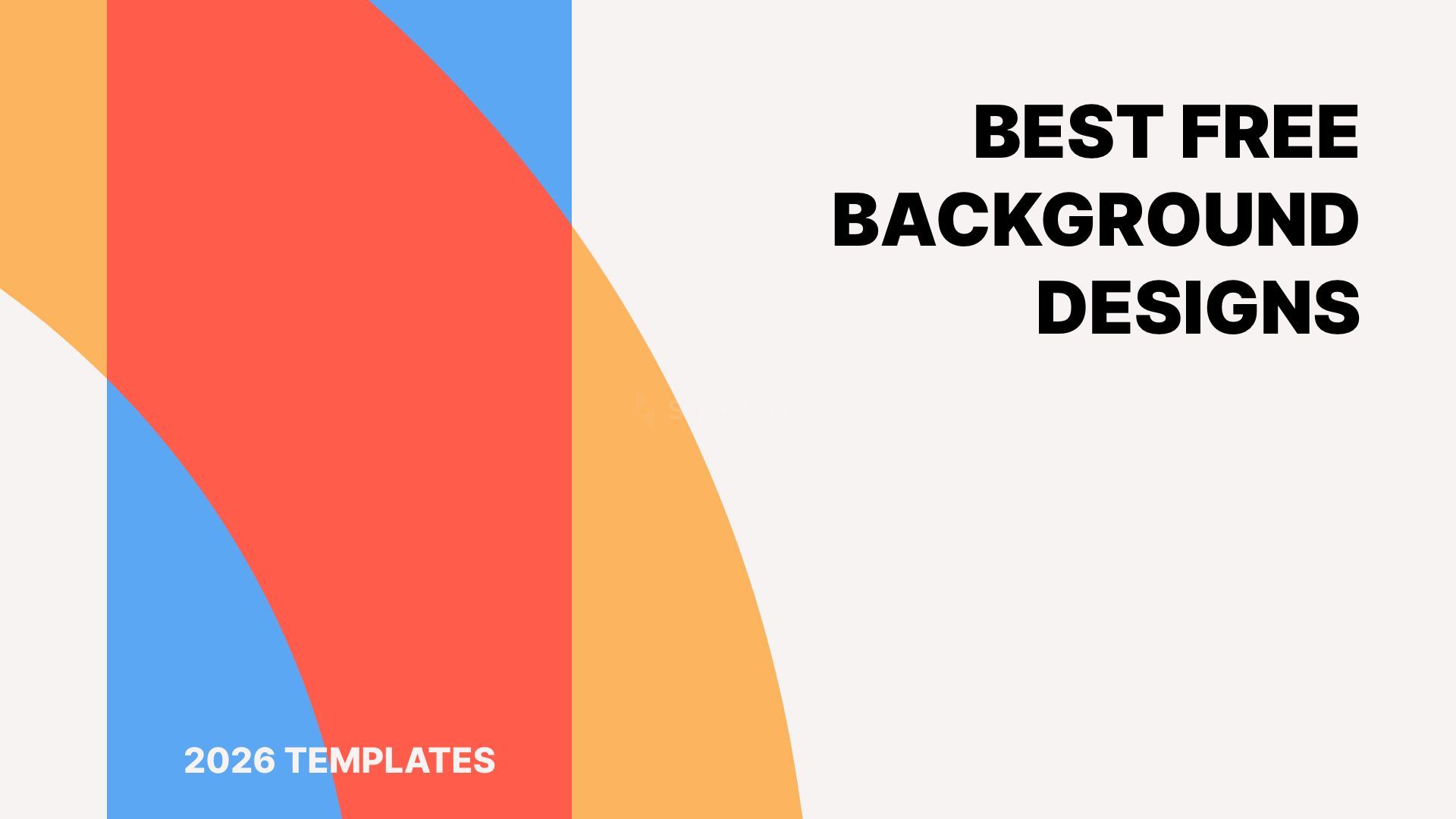
The best free backgrounds for marketing in 2026 are expressive without being chaotic. They use color strategically. They feel branded even before a logo appears.
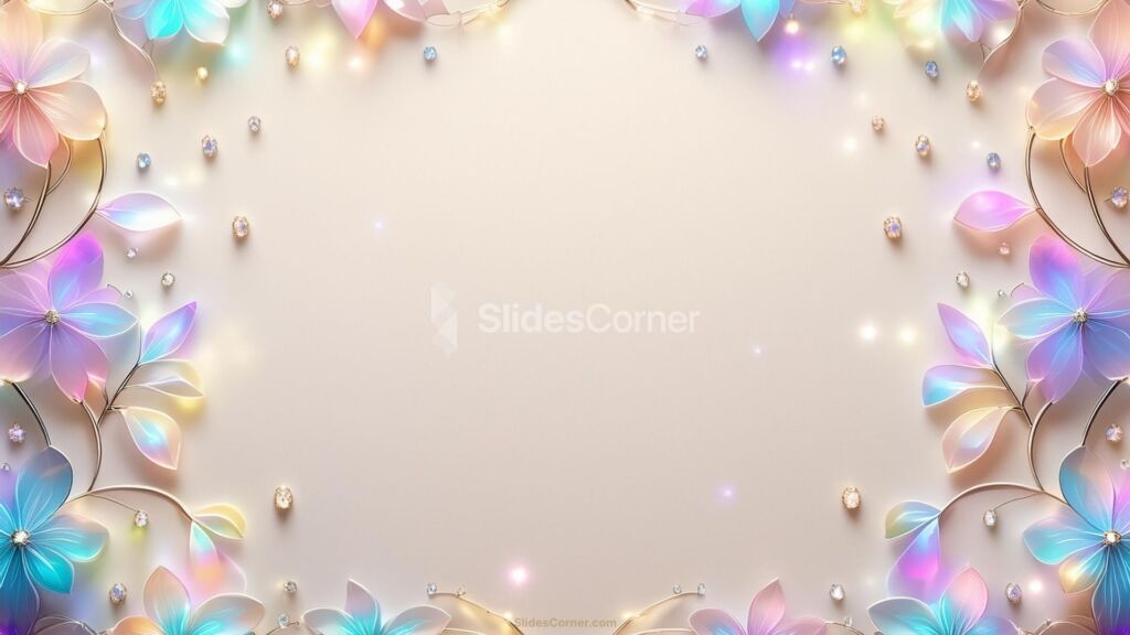
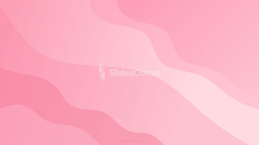
These backgrounds often include bold gradients, soft motion-inspired textures, light abstract imagery, and high-impact contrast areas.


They are designed to support storytelling. Each slide feels like part of a narrative rather than a collection of bullet points.
In sales presentations, the background subtly guides the emotional rhythm. Calm sections for data. Energetic slides for vision. Clean transitions for conclusions.
A professional marketing background doesn’t scream. It resonates. It creates mood, pace, and cohesion.
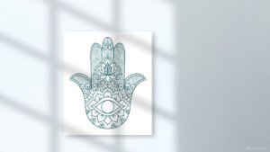
Creative and Portfolio Presentations
When your work is the message
For designers, photographers, writers, and creators, slides often function as a portfolio. The background must disappear so the work can speak.
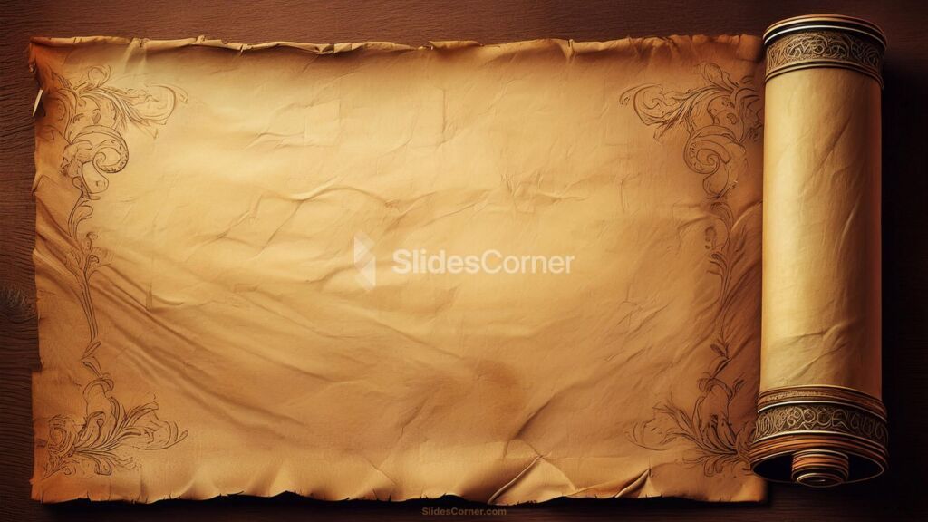
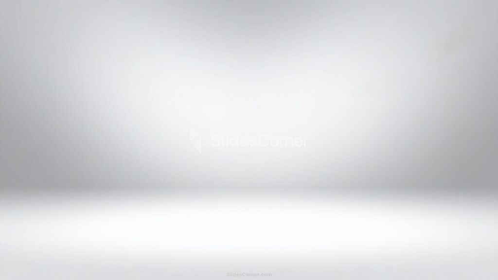
Free backgrounds for creative use in 2026 tend to be extremely restrained. Off-whites, warm grays, soft blacks, and minimal textures dominate. Their role is to frame images, videos, and concepts without stealing attention.


Professional creative slides feel like gallery walls. They provide rhythm and consistency. They make transitions feel intentional. They let the viewer focus on the work rather than the container.
In this context, a “good” background is often one you barely notice. Its success is measured by how invisible it becomes.
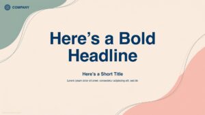
Minimalist and Modern Styles in 2026
Minimalism in 2026 is no longer sterile. It is warm, human, and expressive in subtle ways.
Modern free backgrounds combine:
- Soft gradients instead of flat colors
- Organic shapes instead of rigid geometry
- Gentle textures instead of empty white
- Asymmetry instead of perfect alignment
This evolution reflects how we now consume content: on phones, tablets, ultrawide monitors, and projectors. Backgrounds must be flexible, responsive, and emotionally neutral.


The best minimalist designs feel contemporary without being trendy. They age well. They don’t scream “2026.” They simply feel right.
How to Choose the Right Free Background
Choosing a background is not about taste. It’s about function.
Before downloading anything, ask yourself:
- Who is my audience?
- What emotion should they feel?
- Is this about trust, learning, inspiration, or action?
- Will this be viewed on small screens, large screens, or both?
A professional background aligns with the purpose of the presentation. A sales pitch should not look like a school lecture. A research report should not feel like a fashion magazine.
The most effective backgrounds are those you stop noticing after the first slide. They let content breathe. They create coherence across the deck. They make every slide feel like part of a whole.
Quick Recap: What Makes a Free Background Truly Professional in 2026
- Clean visual hierarchy
- High readability
- Emotional coherence with the message
- Consistency across slides
- Subtlety over decoration
- Flexibility for different content types
- Compatibility with PowerPoint and Google Slides
Questions & Answers
Do free backgrounds really look professional?
Yes. In 2026, many free designs match the quality of premium templates. The difference lies in how well you use them.
Are minimalist backgrounds always better?
Not always. Minimalism works for clarity, but marketing or creative decks may benefit from more expressive designs.
Should I use the same background for every slide?
You can use variations of the same design. Consistency is more important than strict uniformity.
What colors work best for professional slides?
Neutrals, soft gradients, and restrained palettes. Bright colors should be used intentionally, not everywhere.
Is it better to design my own background?
Only if you have design experience. A high-quality free background is usually more effective and faster.
In 2026, professionalism in presentations is not about spending money. It’s about making thoughtful visual choices. With the right free background, your slides can look premium, intentional, and confident—without costing you a single dollar.