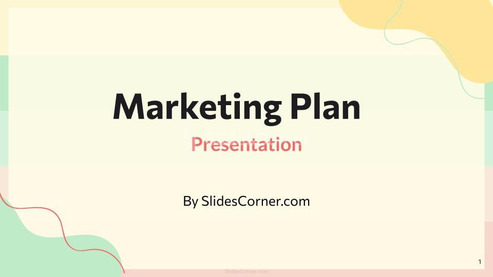
Learn how to design slides people actually read in 2026. Improve clarity, attention, and impact in PowerPoint and Google Slides.
n 2026, we live surrounded by screens. We scroll endlessly, skim instinctively, and decide in seconds what deserves our attention. And yet, in meetings, classrooms, and conferences around the world, slides are still being created as if time had stopped in 2005.
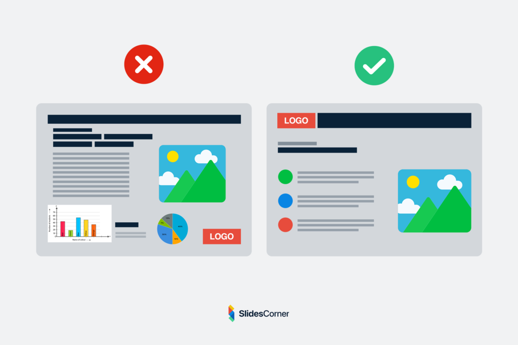
Dense paragraphs. Tiny fonts. Overloaded layouts. Colors that fight the text. Charts no one understands.
The result is predictable: people stop reading.

They look at their phones. They wait for the speaker to explain what the slide was supposed to say. The presentation becomes noise instead of support.
Designing slides that people actually read is no longer a matter of aesthetics. It is a matter of communication survival.
In a world where attention is scarce, every slide must earn its place. It must be readable at a glance, understandable in seconds, and visually calm enough to invite the eye to stay.
This article explores how modern slide design works in 2026, why most presentations fail cognitively, and how to build slides that respect how humans really read on screens today.
Why Most Slides Are Still Unreadable
The core problem is not lack of tools. PowerPoint and Google Slides are more powerful than ever. Templates are abundant. Fonts are accessible. Free backgrounds are high-quality. The real issue is that slides are still treated like documents.
People write on slides the same way they would write in a report or an email. They try to “fit everything in.” They assume the audience will patiently read line by line. But slides are not pages. They are visual frames.
A slide appears on screen while someone is speaking. The brain must choose where to focus: the speaker’s voice or the text. When a slide is dense, it forces the audience into cognitive conflict. Reading and listening compete. The brain solves this by giving up on one of them. Most of the time, it gives up on reading.
In 2026, this effect is even stronger. Our brains are trained by social platforms to scan, not to parse. We don’t read blocks of text on screens. We hunt for signals. A slide that looks like a wall of words sends an immediate message: “This will be work.” And the audience disengages before the first sentence is finished.
How People Actually Read Slides Today
People do not “read” slides in the traditional sense. They scan them.
Eye-tracking studies over the last decade consistently show the same pattern: viewers look first at the largest element, then at areas of high contrast, and only afterward at smaller details.
In practice, this means:
- The title is often the only fully read element.
- The center of the slide gets more attention than the edges.
- Long lines of text are skipped.
- Visual clutter reduces comprehension.
A readable slide in 2026 is designed for this behavior. It assumes that the viewer will not read everything. It accepts that reality and works with it. The goal is not to force reading. It is to make reading effortless.
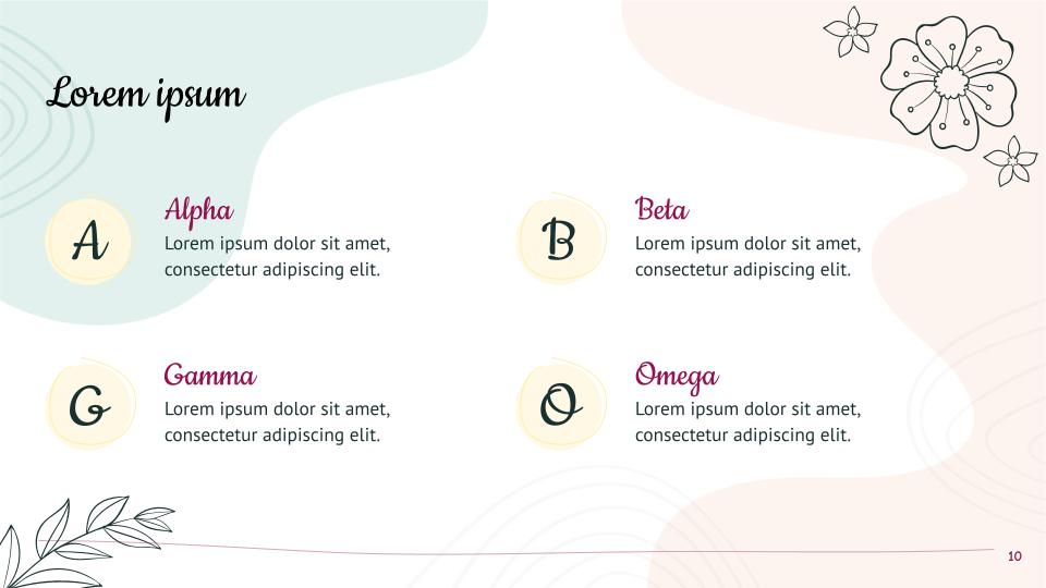
Good slides act like signposts. They guide the eye. They present one idea at a time. They allow the viewer to understand the core message in under three seconds. If a slide cannot be understood in three seconds, it is too complex.
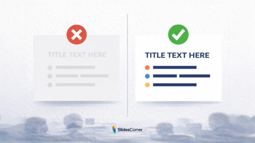
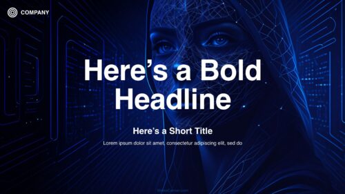
The Role of Visual Hierarchy
Visual hierarchy is the silent language of design. It tells the brain what matters most without using words.
In readable slides, hierarchy is obvious:
- One element clearly dominates.
- Supporting information is visibly secondary.
- Everything else fades into the background.
Hierarchy is created through size, contrast, spacing, and position. It is not decoration. It is structure.
When hierarchy is missing, every element fights for attention. The slide feels noisy even if it is not visually “busy.” The viewer does not know where to look.
In 2026, the most effective slides feel calm. They contain less, but what they contain is intentional. A readable slide does not try to say everything. It says one thing well.
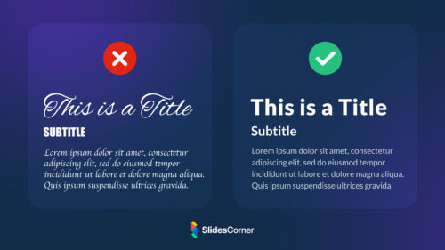
Typography in the Age of Screens
Fonts are no longer a technical detail. They are the backbone of readability.
Modern presentations are viewed on:
- Laptops
- Tablets
- Phones
- Large projectors
- Ultrawide monitors
- Video calls
A font that looks acceptable on your laptop may become illegible on a projector or a mobile screen. Readable slides in 2026 use typefaces designed for screens. They avoid overly thin strokes. They favor clarity over personality.
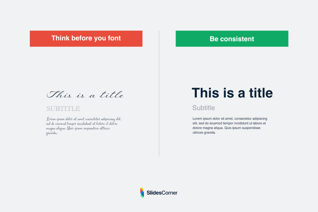
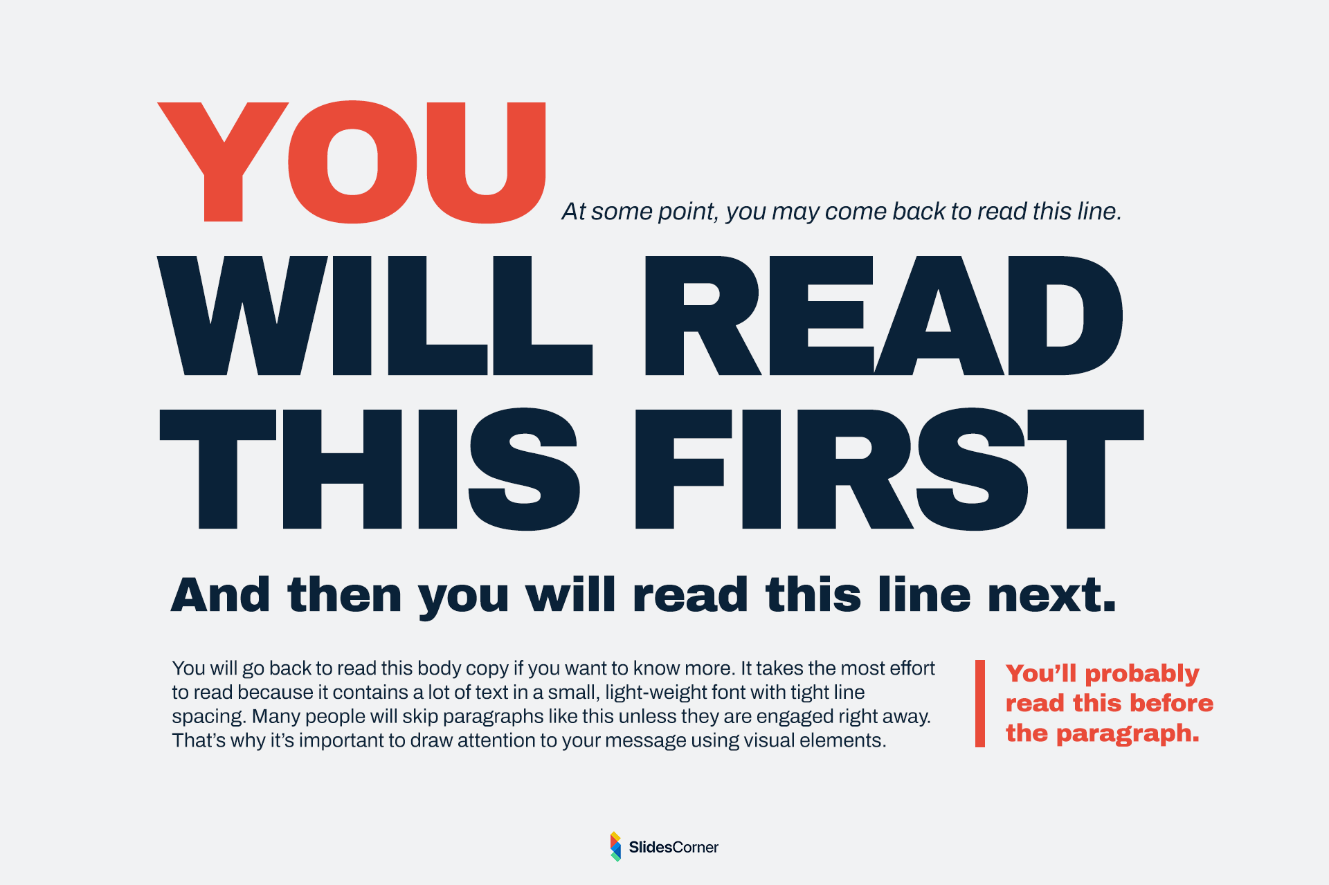
But typography is not only about the font choice. It is about scale. Many unreadable presentations fail because of one simple mistake: the text is too small.
Designing slides on a large monitor creates a false sense of space. What looks “fine” to the creator often becomes microscopic to the audience. Readable slides exaggerate size. They embrace whitespace. They assume distance.
In modern decks, a single sentence in large type is often more powerful than a paragraph in small print. The slide becomes a visual echo of the speaker’s voice, not a replacement for it.
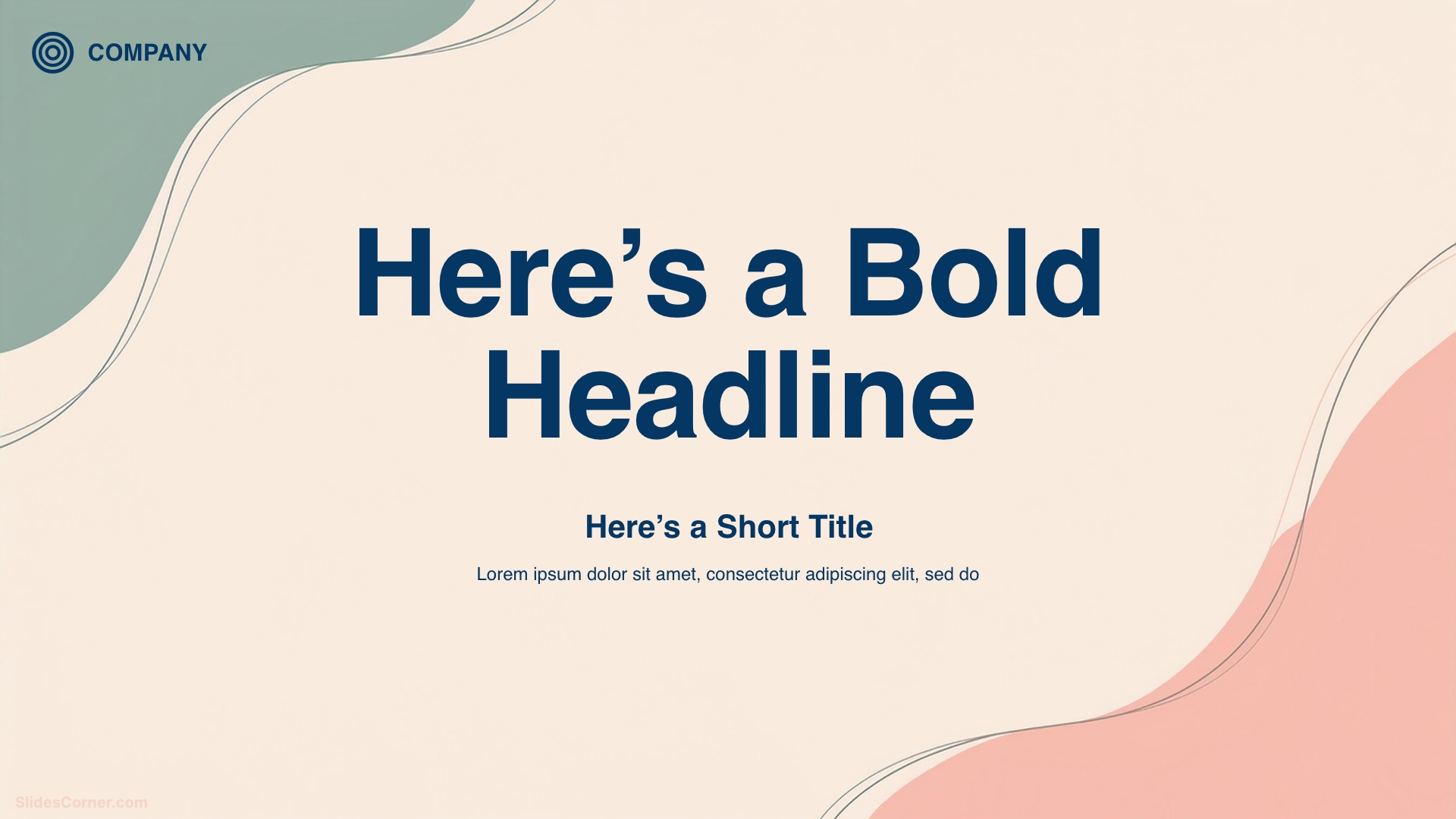
Backgrounds as Cognitive Support
Backgrounds are often treated as decoration. In reality, they are part of the reading experience.
A background defines contrast. It determines where the eye can rest. It influences emotional tone. It can either support legibility or destroy it.
In 2026, the best backgrounds are quiet.


They do not shout. They do not compete. They create a visual field where text feels anchored.
Professional backgrounds are designed with content in mind. They provide subtle structure. They leave space. They reduce the need for heavy boxes and shapes. A good background makes text feel intentional even before it is placed.
This is why minimalist and abstract backgrounds dominate modern slide design. They offer atmosphere without noise. They frame content instead of trapping it. A readable slide is not only about what you put on it. It is also about what you remove.
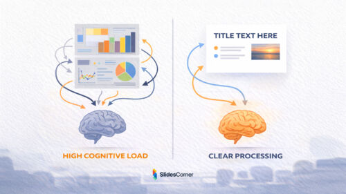
Cognitive Load and Attention Fatigue
Every slide adds cognitive weight. Every element asks the brain to process something: a word, a shape, a color, a number. When too many elements appear at once, the brain slows down. This is called cognitive load. It is the mental effort required to understand information.
Unreadable slides are rarely unreadable because they are ugly. They are unreadable because they ask too much at the same time.
In 2026, audiences arrive already tired. They come from emails, dashboards, chats, and feeds. Their mental bandwidth is limited. A slide that demands heavy interpretation feels exhausting.
Readable slides reduce friction. They do not require decoding. They do not hide the point. They do not force comparison between multiple ideas on the same frame. Each slide answers a single question. What should I understand right now? When a slide tries to answer three questions at once, it answers none.
Good presentation design is not about adding clarity through more information. It is about removing everything that does not serve the current idea.
Designing for Distance and Real Rooms
One of the most common mistakes in slide design is designing for yourself. You sit close to the screen. You know the content. You can zoom. You control the environment. Your audience does not.
They may be sitting far from the screen. They may be watching through a projector with low contrast. They may be following on a phone during a video call. They may be distracted by the room.
Readable slides are designed for the worst conditions, not the best.
They assume:
- Imperfect screens
- Bright rooms
- Small displays
- Partial attention
This changes everything.

Text must be larger than feels comfortable to the creator. Contrast must be stronger than seems necessary. Spacing must be more generous than looks “efficient.”
In 2026, slides are often captured in screenshots, shared in chats, or viewed asynchronously. A readable slide should survive outside the presentation.
If a slide cannot be understood when seen alone, it is too fragile.
The Myth of “Everything on One Slide”
Many people try to compress information. They believe fewer slides means better efficiency. The result is dense frames packed with text, charts, and notes.
But slides are not pages. They are moments. A presentation is not judged by how few slides it has. It is judged by how clearly it moves. Breaking content into more slides is not a weakness. It is a kindness.
Each slide becomes lighter. Each idea gains space. Each transition creates rhythm. Readable presentations in 2026 often have more slides, not fewer. But each slide does less.
Instead of one slide with six ideas, you get six slides with one idea each.
The audience never feels overwhelmed. They stay oriented. They keep reading. Clarity is not compression. Clarity is separation.
How Layout Shapes Understanding
Layout is invisible structure. It is how elements relate to each other in space.
A well-designed layout tells the brain:
This is the title.
This is the main point.
This is supporting detail.
Without reading a single word.
Unreadable slides often suffer from ambiguous layout. Everything floats. Nothing anchors. The eye does not know where to begin.
Readable slides create patterns:
- Titles appear in the same place.
- Content aligns consistently.
- Margins are respected.
- Empty space is intentional.
This consistency builds trust. The audience learns how to read your slides after the first few frames.
They stop decoding structure and focus on meaning. Layout is not about decoration. It is about predictability.
When every slide looks structurally different, the brain must re-learn how to read each one. Readable decks feel like a single visual system, not a collection of unrelated screens.
Golden Rules for Readable Slides in 2026
- One idea per slide
- Text large enough to read from the back of the room
- Strong contrast between text and background
- Clear visual hierarchy
- Consistent layout across the deck
- Generous spacing and margins
- Backgrounds that support, not compete
- Fewer words, more intention
- Slides that make sense even without the speaker
Questions & Answers
Why do people stop reading slides so quickly?
Because the brain is overloaded. Dense slides demand too much effort in too little time.
Is it bad to put full sentences on slides?
No, but they must be few and large. One clear sentence is better than six small ones.
How many words should a slide have?
There is no fixed number. The right amount is the minimum needed to express one idea clearly.
Are images better than text?
Images help when they add meaning. Decorative images can distract and reduce readability.
Do readable slides look boring?
No. They feel calm, confident, and intentional. Boring slides are those that confuse.
Should slides replace what I say?
No. Slides should support your voice, not compete with it.
Can good backgrounds really improve readability?
Yes. The right background increases contrast, reduces noise, and creates visual stability.
Designing slides that people actually read in 2026 is not about trends or tools. It is about respect.
Respect for attention.
Respect for cognitive limits.
Respect for the human brain.
When your slides are readable, your ideas become lighter. Your message moves faster. Your audience stays with you.
And that is what modern presentation design is really about.