Learn how to choose the perfect presentation background for PowerPoint or Google Slides to enhance clarity, style, and impact.
When designing a presentation, we often think first about the message, the flow of slides, and the data we want to include. But behind every piece of content is a silent yet powerful design decision: the background. This single visual layer influences everything from mood to clarity, and can mean the difference between an audience leaning forward with interest or losing focus entirely.
A background acts like a stage set in a theater production. The actors—your words, charts, and images—take center stage, but the set defines the atmosphere and subtly guides how the story is received. Choose poorly, and your slides might appear chaotic, amateurish, or disconnected from your message. Choose well, and the background becomes invisible in the best way possible, supporting your narrative while giving the presentation a polished and professional feel.
In PowerPoint, Google Slides, and similar platforms, the background is not just an afterthought—it’s a foundational design element. Understanding how to select it thoughtfully is a skill every presenter should master.
Balancing Aesthetics with Function
A visually beautiful background that doesn’t allow text to stand out is a design failure. The primary role of any background is to support communication, not compete with it. When a background’s texture, brightness, or complexity makes it hard to read the title or bullet points, it’s working against your goal.
Prioritizing Clarity Over Decoration
Think of your slides as a hierarchy: your core message sits at the top, supported by images, data, and visual structure. The background is part of that structure, but it must remain subtle enough for the audience’s attention to be anchored where you want it. That’s why clarity always outweighs decorative appeal. The most successful backgrounds are those that make content shine without calling attention to themselves.


Sometimes, this means toning down a favorite design—adding a transparent overlay to a photo, desaturating an image, or softening a gradient. It’s not about losing beauty, but about ensuring balance.
Adapting the Background to Your Topic and Audience
Just as a speaker adjusts their tone depending on who they’re addressing, your background should reflect the expectations and context of your audience. Imagine walking into a boardroom and presenting quarterly financial results with a background of neon waves—it might be visually striking, but the mismatch will distract from your authority. On the other hand, a minimalist, dark-on-light layout communicates seriousness and focus.
Tailoring Your Background to Your Audience
If you’re presenting to a classroom, more vibrant tones and engaging imagery can help keep students’ attention. In creative industries, a textured or themed background can reinforce brand personality and showcase originality. For a non-profit campaign, warm, soft colors and human-centered photography can create empathy and connection.


Key takeaways for matching background and audience:
- Corporate settings: Minimalist designs with neutral colors for professionalism.
- Educational contexts: Bright and dynamic visuals to maintain engagement.
- Creative fields: Unique textures or themes to express originality.
- Non-profit causes: Warm tones and human imagery to inspire connection.
Matching your background to both content and audience creates harmony and helps the presentation feel intentional rather than generic.
Understanding Different Background Types
Solid color backgrounds are the simplest and most versatile option. They work for almost any subject, are easy to brand, and offer strong control over contrast. Gradients add depth while keeping a clean, modern look. They can also subtly guide the viewer’s eye, depending on the gradient’s direction and color choice.
Choosing the Right Style for Your Message
Photographic backgrounds are more complex. A single high-resolution image can set an emotional tone instantly—think of a misty forest for an environmental talk or a skyline for a business pitch. However, without careful treatment, photos can overwhelm your content. Filters, blurs, or overlays help them stay in the background where they belong.
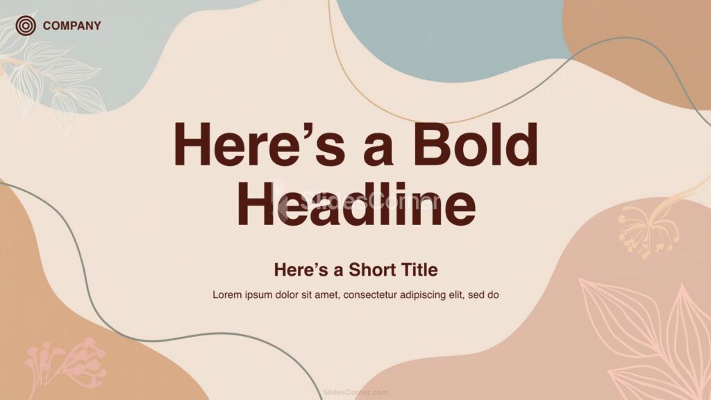
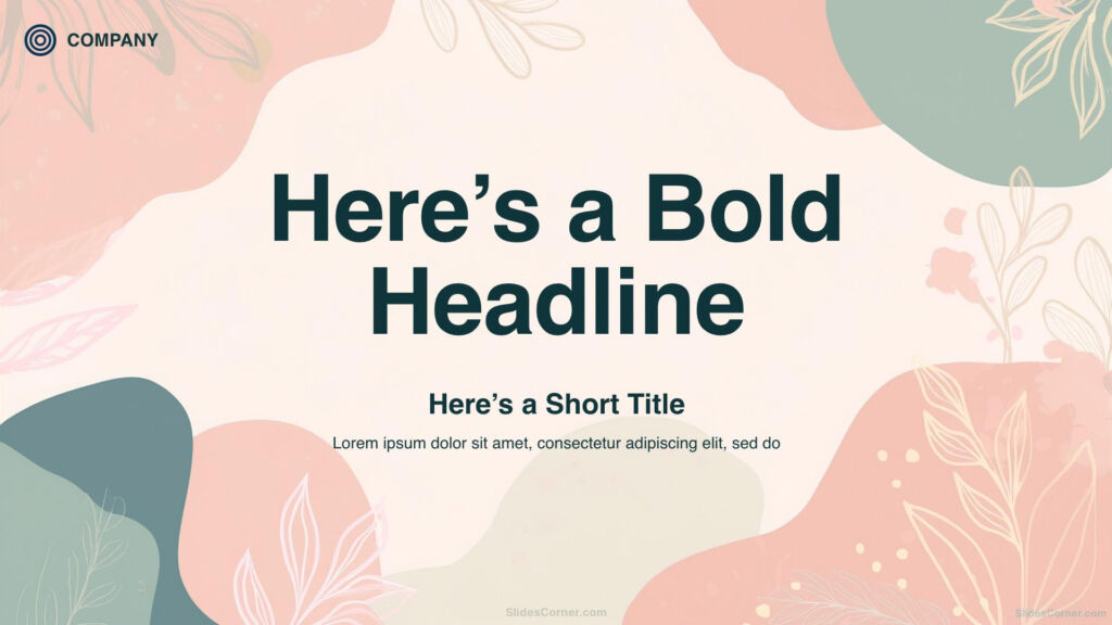
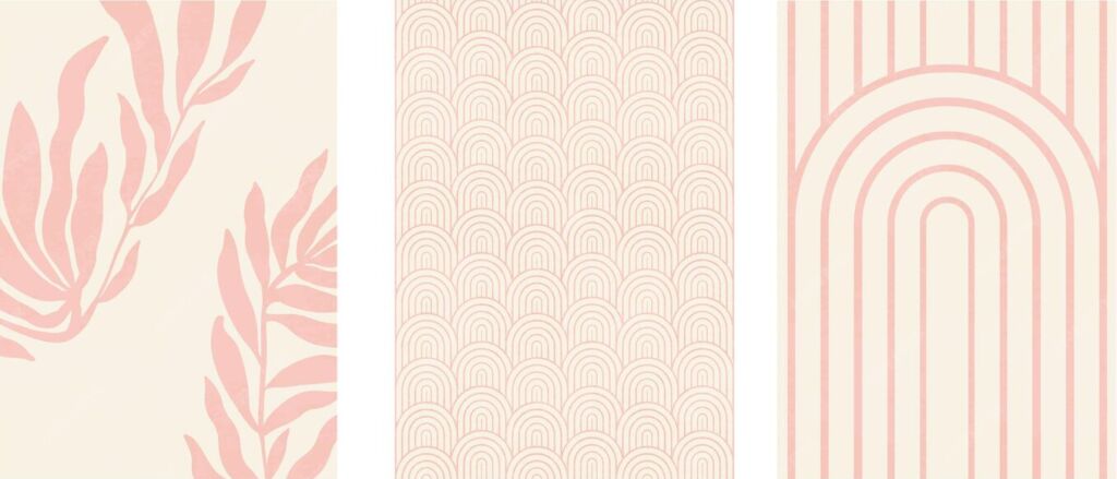
Patterns and textures provide personality and are especially effective for title slides or section dividers. They can signal a theme or era—vintage paper textures for history, sleek geometric lines for tech—but should be used with restraint.
The Psychological Impact of Colors and Styles
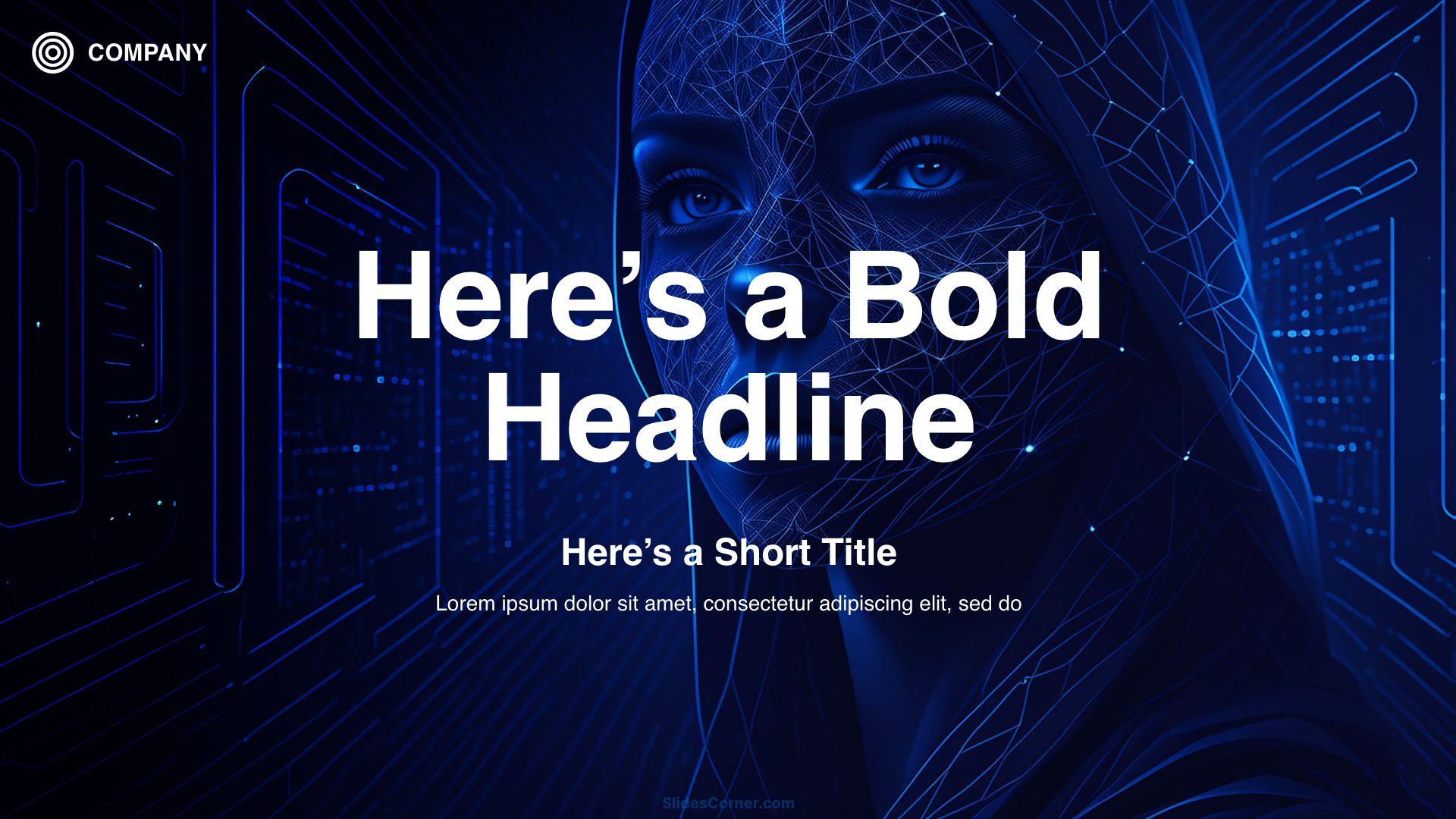
Every color and style choice influences your audience subconsciously. Dark backgrounds with white text tend to feel more formal, dramatic, and cinematic. Light backgrounds feel fresh, open, and professional, but can appear bland if too plain. Warm tones like orange and red are stimulating and convey urgency or excitement. Cool tones like blue and green calm the viewer and evoke trust.
The Psychology of Shapes and Patterns
Patterns and visual motifs carry meaning as well. Organic shapes and soft curves feel friendly and human, while sharp angles and minimal grids feel structured and precise. A background’s visual language should reinforce, not contradict, your message. An awareness of design psychology ensures your slides communicate on both an intellectual and emotional level.
Common Mistakes in Background Selection
One of the most frequent errors is overdesign—choosing a background so detailed or colorful that it steals attention from the content. Another is ignoring how the background interacts with text. A stunning high-contrast photo might make part of the slide unreadable if text overlaps a bright area.
Common Background Mistakes to Avoid
- Overdesign: Backgrounds that are too detailed or colorful distract from your content.
- Poor Text Contrast: High-contrast images can make text unreadable.
- Inconsistent Styles: Using different styles across slides can feel disorganized.
- Lack of Testing: Failing to check how slides appear in real presentation conditions can cause unexpected visual issues.
Inconsistent backgrounds across slides can also disrupt flow. While variety might seem interesting, it often feels disorganized and unprofessional. Using unrelated styles from one slide to the next signals a lack of planning.
Lastly, presenters sometimes forget to check how their backgrounds look under real presentation conditions. Colors shift under different lighting; a safe choice on a laptop might look garish on a projector. Testing in advance prevents these surprises.
Case Study: Selecting a Background Step-by-Step
Imagine you’re preparing a presentation on sustainable architecture. The audience is a mix of architects, investors, and city planners. You want to convey innovation, trust, and environmental consciousness.
You begin by considering tone: the subject is serious but forward-thinking, so you decide against playful patterns. A color palette emerges—greens and earth tones paired with clean whites and grays.
You review options:
- A solid color could work, but might lack depth.
- A gradient from pale green to white feels modern and light.
- A background image of architectural lines combined with leafy elements seems ideal, but the original photo is too busy.
To solve this, you desaturate the image, apply a 40% white overlay, and position the main content area where the background is least detailed. The result is a design that’s distinctive, relevant, and still highly readable.

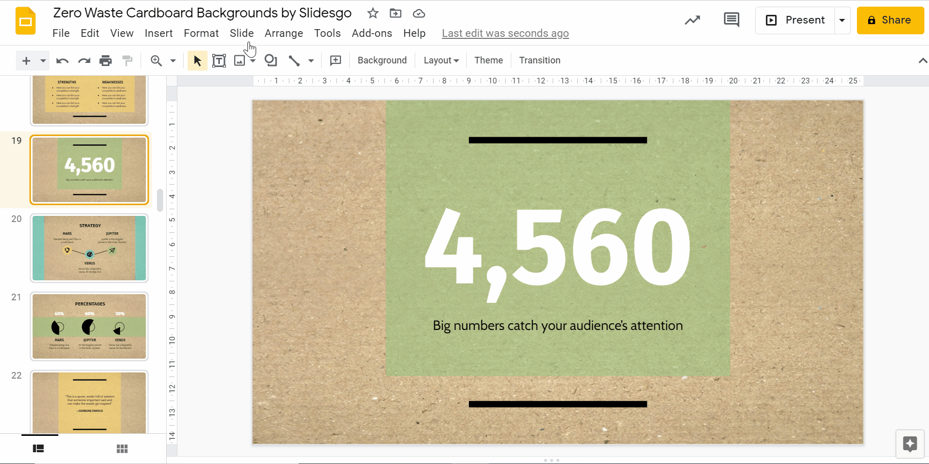
Customizing Backgrounds in PowerPoint and Google Slides
Both tools allow fine control over backgrounds. In PowerPoint, you can fill slides with solid colors, gradients, images, or textures. Transparency sliders make it easy to soften an image, and you can apply backgrounds to one slide or the entire deck for consistency.
In Google Slides, the process is similar. Uploading an image background is straightforward, and you can layer shapes or semi-transparent rectangles over it to ensure text clarity. One useful trick is to create a “master slide” with your chosen background and apply it across all slides, ensuring uniformity.
Experimenting with these tools lets you fine-tune backgrounds for both visual appeal and function.
Where to Find High-Quality Backgrounds
While built-in templates are convenient, they’re also widely used, which can make your presentation look generic. Independent design platforms, free stock photo sites, and specialized background collections offer more distinctive options. Look for high-resolution files, check licensing for commercial use, and choose designs that align with your theme.
Curated background collections, such as those on your own site, offer a shortcut to professional results. By organizing them by style—minimalist, abstract, seasonal—you make it easy for others (and yourself) to find the right fit quickly. Sites like SlidesCorner.com provide a vast selection of free backgrounds, ensuring you have plenty of options to match any presentation style.
Questions & Answers
Should my background always match my company branding?
In professional contexts, consistency with branding is recommended, but avoid overusing logos or branded graphics.
Are textured backgrounds suitable for serious topics?
Subtle textures can add depth, but they should never overpower the text or distract from key points.
How can I test if my background is readable?
Display it on the actual screen you’ll use for your presentation and check visibility from different distances.
Is it okay to change backgrounds between slides?
For professional presentations, keep backgrounds consistent to maintain cohesion and avoid visual disruption.
Final Quick Checklist for the Perfect Background
- The background allows all text to remain easily readable.
- It matches the tone and expectations of your audience.
- Color and style reinforce, rather than contradict, your message.
- The design has been tested on the actual presentation medium.
- The source is high-quality, original, and legally licensed.