Here are some pointers for a successful product launch and to deliver a powerful presentation that leaves a potentially lasting impact.
As an entrepreneur, speaking at influential industry trade shows and conferences positions your products and services center stage, exactly where you want your brand to be. Presentations have always been a crucial part of business activity at every scale and in every industry.
When done right, showcasing your brand in a dynamic presentation can reel in new customers, attract capital and generate positive media buzz.
While giving a presentation at a physical meeting, it’s easier to break the ice with a joke and get feedback as you go on, as opposed to an online meeting where everyone else is muted. Still, online presentations can turn out exceptional if done right.
Here are some pointers for a successful product launch and to deliver a powerful presentation that leaves a potentially lasting impact.
Before you even begin writing your slide copy, think about what you want your presentation to do.
Before starting, ask yourself some important questions.
- What is the one thing you want your audience to remember?
- How do you want people to feel at the end?
- Is there a specific action you want them to take after you’re done?
Write down these buzzwords in a document. They won’t be part of your presentation, but they can help you create an information roadmap. These initial ideas will be helpful guideposts to return to as you further craft your presentation. They may even help undertake one of the hardest tasks of all: getting started.
Related: Don’t do this when you show your presentation.
Prepare a powerful opening.
You should cast a spell on your opening, as this is the most crucial part of your talk. Start with an intriguing question or a personal story. Witticism perks up people as well. If you are demonstrating or giving a tutorial, stage your product live and have the audience decide for themselves.
Something important: give your audience something to remember you by.

Influence them emotionally.
To achieve this you must know your subject intimately. Next, get your audience to emotionally connect with your story, but try not to overwhelm people with too many numbers and records and kill your presentation. Tell them the story behind the numbers. Aim for the heart and you’ll have them listening spellbound.
You can talk about a major disease with facts, symptoms and death toll, but it’s not until you tell your own personal story that people start to really pay attention.
Think outside of the box.
Another point pertinent to a successful presentation is good visuals. Show and tell. Conceptualize your topic in a way that stands out of the crowd. Let it be different and people will certainly remember.
To achieve this, get a well designed theme to piece up your presentation together and give it a more visually appealing look. Of course, you do not have to stick to PowerPoint. There are other options available that can help you engage your audience in a more fluid and dynamic way like Google Slides.
Keep in mind, if you have regulars in your audience, they will always expect a fresh approach from you. It is the eagerness and anticipation of something new that has them hooked, and you should not disappoint. Always have a trump card. Keep a trump card, and save it for the last moment.
When we were asked to give a software review, we kept our home-made 3D demo for the very end and left everyone stunned and speechless. It works every time.
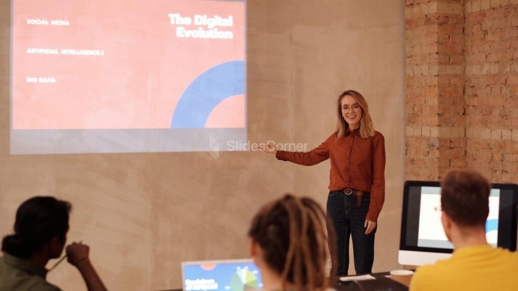
Practice to Build Confidence.
Talking through your presentation will help you feel confident in your material. In fact, some experts recommend rehearsing as many as ten times in order to build this confidence.
You should write a few notes—if you’d like—to keep you on track. Studies have shown that writing speaker notes by hand helps presenters remember things more easily, as opposed to when typing them out.
Related: How to make a powerful presentation
Things Presenters Usually Get Wrong
When you attend a conference with the participation of important personalities, many of them can make exquisite presentations, while others make them painful to watch.
So what was the difference between these two types of presenters? A few things.
To be an effective trainer, you need to keep it short, keep it sharp and keep it moving. If you find yourself reading the PowerPoint slides aloud, you’ve justly earned the blank or hostile looks glaring at you. Then, the only redemption possible is ending early.
Using PowerPoint or Google Slides as a crutch.
Before PowerPoint or Google Slides creating slides was a real hassle so most good presenters didn’t bother, and surprise! The presentations went just fine. Now however, many presenters use PowerPoint as a crutch to keep focused and on track, and they often end up reading bullets to a room full of people praying to die.
Talking when they should be silent.
Some people need quiet time to reflect and process information. Taking the occasional breath will make your training and presentations much more effective.
Telling people to shut up.
One of the less subtle ways is to start a computer-based conference call by immediately muting the line, “to cut down on background noise.” Another is to ask people to hold their questions to the end — at which point their biological needs far outweigh any pearls of wisdom you might have for them.
Running late.
No matter if you have a hard time guesstimating how long it will take to complete a task or if you blame your lateness on everyone but yourself, there are ways to tame your tardiness.
Like it or not, being on time matters. In fact, it matters a lot. It communicates to others whether they can trust and rely on you. It gives others insight into how you view them and how you view yourself. Being chronically late can have countless unintended consequences, and it’s a seemingly small thing that can have a huge and lasting negative effect on your career. By contrast, learning the importance of punctuality – or being consistently on-time, or even early – is an incredibly simple way to set yourself apart from the crowd. It allows you to make an instant good impression, and it can help you reach your goals faster by helping others see you as someone worth listening to.
Consider that when you are giving a presentation, you should have to allow about 15 percent of your time for questions at the end of the presentation.
Over-sharing.
I don’t care about your kids, your dogs, your spouse, or even trivia about the subject being presented. Give me only the “need to know” and skip the “nice to know” filler crap. If you are extolling the virtues of your products, stick to the things I need to know. Save the story about the cute thing your kid said after soccer practice, for your coworkers. No, strike that, they don’t want to hear it any more than I do; they’re just being polite, while saying a silent prayer that you aren’t going to segue into a sales pitch for overpriced wrapping paper for said kid’s soccer fundraiser.
Less wordy slides.
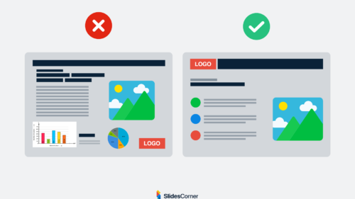
It’s well established in research literature that too much text on a slide is the worst way of transferring information. The brain simply cannot multitask as well as people think it does. If you deliver complex information – and ask your audience to read words on a slide at the same time – they won’t retain a thing.
Some speakers deliver TED talks with no slides, while many others use presentation design software such as PowerPoint or Google Slides.
We actually prefer slides, if done well. And the reason we prefer slides is because of a concept well established in neuroscience literature. It’s called picture superiority. Simply put, if you deliver information verbally, your listener will retain about 10 percent of the content; add a picture and retention soars to 65 percent.

Our brains are wired to process visual information – such as pictures – very differently than text and sound. Scientists call the effect “multimodal” learning: pictures are processed in several channels instead of one, giving the brain a far deeper and meaningful encoding experience.
PowerPoint and Google Slides are the presentation tools of choice for more than 90 percent of today’s business presentations. We’ve seen a lot of bad PowerPoint presentations and a lot of great ones. We’ve seen beautiful slides created with Google Slides and some really awful ones. Regardless of the design tool, the slides that work best have a balance of words and images rather than just text.
If you want to create a TED-worthy presentation to wow your audience, utilize images and photos. You don’t have to eliminate text entirely, but favor visuals over words.
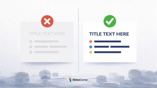
There’s no one-size-fits-all word count when it comes to slide text. Just use powerful single words, short phrases or clear and concise single sentences per slide, versus cramming slides full of trailing bullet points and long-winded paragraphs.
A popular presentation guideline to incorporate into your plans is the 5/5/5 Rule. This means that slides should include:
- No more than 5 words per line of text.
- No more than 5 lines of text per slide.
- Text-heavy slides should be capped at 5 per entire presentation.
8 important questions to consider when crafting your next PowerPoint or Google Slides presentation
Your PowerPoint or Google Slides presentation slides have to be spot-on. This goes for whether you’re presenting at a big conference or for customers or colleagues. Not only do carefully planned slides help you stay on-topic, more importantly, they help you tell a memorable story that informs, engages and hopefully even inspires your audience to do business with you.
1. What do I need to think about before designing my first slide?
Your first step should be identifying key messages, then creating a clear outline for their delivery. Focus first on a single memorable message that you want your audience to understand and what value your message will have to them.
Also consider what your ultimate goal is. For example, is your aim in presenting to earn customers or strategic partnerships? Is it to broaden your industry influence or highlight new products and services?
2. How can I create a presentation that really connects with my audience?
Show them that you understand their needs by presenting a value proposition tailored to them and you’ll make a lasting impact. This is something only you — not your PowerPoint slides — can do. If slides alone could win you business, salespeople would just email them to prospects and say, ‘Please return with a signed copy of the contract’.
To reach your listeners, connect with them in the way you connect with anyone else in your life — with empathy and emotion. Explain how your idea (or product or service) can improve their lives or work. Be careful not to come off too hard sales-y, though. Keep your tone conversational, informative and friendly, not corporate and stiff.
3. How many slides should I have?
How many slides you feature depends on how much visual support you need for what you’re explaining.
Consider using venture capitalist and business author Guy Kawasaki’s 10/20/30 PowerPoint Rule: 10 slides presented in 20 minutes, with no font smaller than 30-point type.
Kawasaki suggests tackling the following topics in 10 short and sweet slides total, especially if you’re addressing venture capitalists:
- Problem
- Your solution
- Business model
- Underlying magic/technology
- Marketing and sales
- Competition
- Team
- Projections and milestones
- Status and timeline
- Summary and call to action
4. What types of images should I incorporate into my slides and why?
Studies show that visual information, when delivered well during a presentation, can capture and hold your audience’s attention much better than if you use no images. Images also enhance information recall.
Whichever images you use, they should always be high quality and professional, never cheesy clip art.
Pictures of faces are perhaps the most powerful presentation visuals of all. People connect with other people, so I like to incorporate faces, hands, and other human elements in my slides whenever I can. High resolution images of your company’s logo and products are also strong choices.
5. What about slide transitions?
It’s best to use them sparingly, if at all. If you do use transitions, do so only to strengthen a visual metaphor or to show a process. Too much pizazz and your presentation can quickly go from professional to school project.
6. Should I add audio and video elements to my presentation?
Yes, but tread lightly and carefully. Audio, video and animation features tend to be the first to break when switching software versions, say from PowerPoint 2010 to PowerPoint 2013.
Saving your presentation’s audio and video files locally to the computer or USB drive you plan to use during your presentation. This eliminates most playback problems, like long buffering times due to a slow internet connection.
7. Should I use charts? If so, what kind?
On his popular blog, marketing expert Seth Godin says the only reason to include statistics in a PowerPoint presentation is to “advance an argument.” For example, if you want to parade impressive customer base growth over time, a simple, well-organized chart can help you make your point. Limit yourself to one story (or main point) per chart.
As for what types of charts to use, Godin states on his blog that he prefers line and pie charts (as opposed to bar charts) and suggests animating them for optimal impact.
8. What are some common PowerPoint / Google Slides mistakes and clichés to avoid?
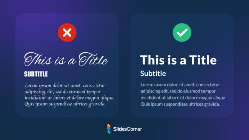
One of the worst offenders is reading all of the text on each slide, word for word. Some other offenses people would like to see retired forever include: confusing charts, freaky fonts, animated text and SmartArt, which is neither smart nor art.
–
Remember that your PowerPoint or Google presentation slides have to be spot-on. This goes for whether you’re presenting at a big conference or for customers or colleagues. Not only do carefully planned slides help you stay on-topic, more importantly, they help you tell a memorable story that informs, engages and hopefully even inspires your audience to do business with you.
Source: entrepreneur.com


