Discover how to choose the perfect marketing presentation background in 2026 – color psychology, design trends, and expert tips included.
In 2026, attention is the most valuable currency in marketing. Whether you’re pitching to investors, presenting quarterly results, or launching a new campaign, your presentation background is no longer a decorative choice — it’s a strategic asset.
A well-designed background doesn’t just look good; it communicates trust, clarity, and professionalism. It influences how your audience feels, how they process your message, and even how much of it they remember.
“Design is the silent ambassador of your brand.” — Paul Rand
Let’s dive into the complete guide to selecting the perfect background for your marketing presentation in 2026, covering color psychology, layout, visual hierarchy, trends, and the most common mistakes professionals make.
1. Understanding the Psychology of Color in Marketing Presentations
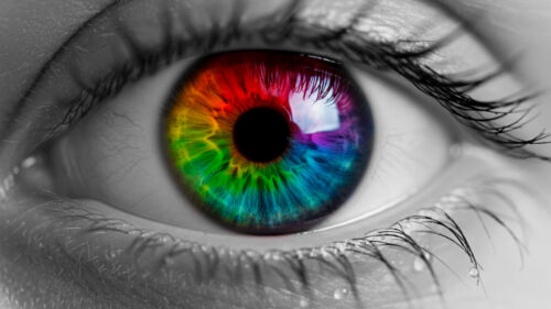
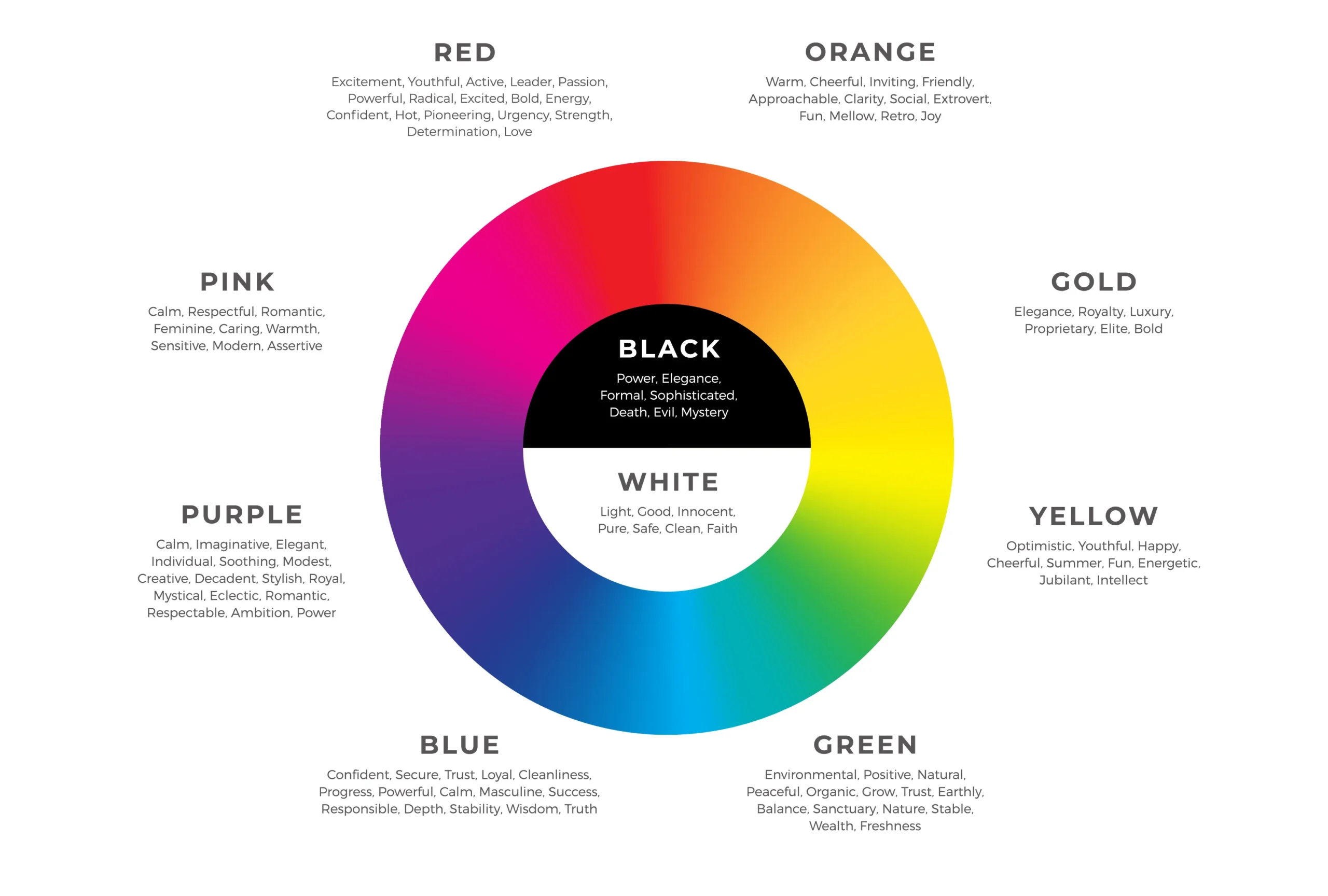
Color is emotional. Each tone sends subconscious signals that shape how people perceive your message.
1.1. Warm vs. Cool Colors
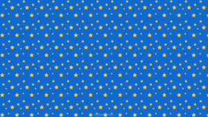
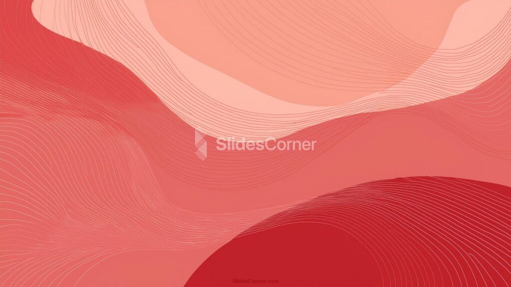
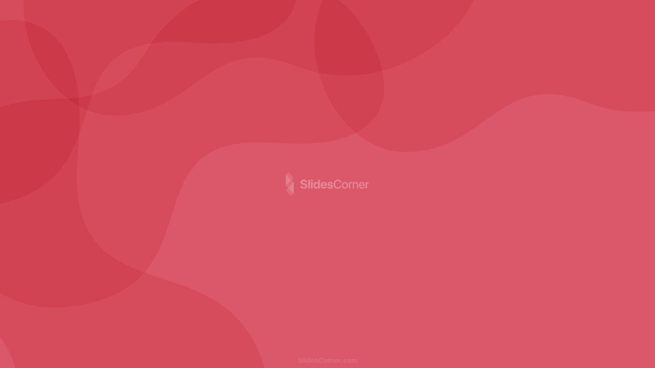
- Warm colors (red, orange, yellow) evoke energy, excitement, and confidence. Great for sales and campaign launches.
- Cool colors (blue, green, purple) inspire calm, trust, and intelligence. Ideal for corporate and data-heavy presentations.


1.2. Neutral and Minimal Backgrounds
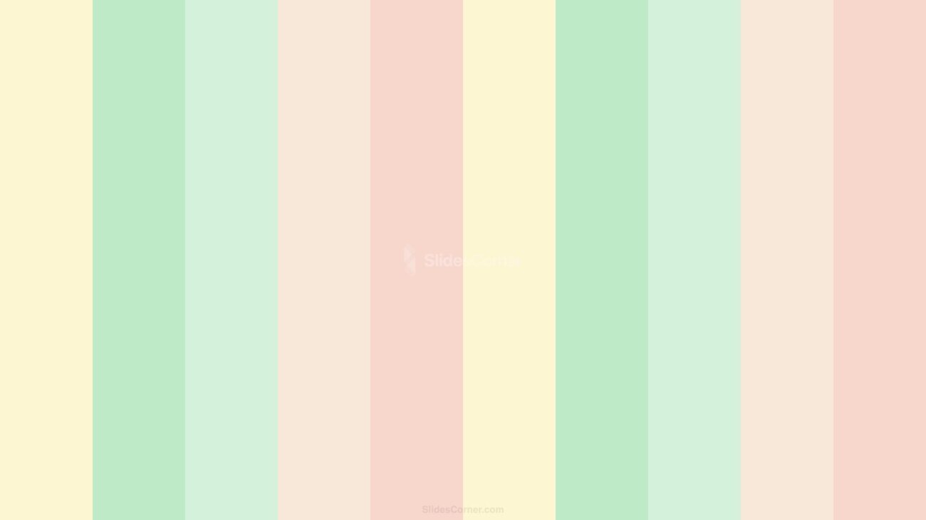
In 2026, minimalist backgrounds are dominating. Soft whites, grays, and beige tones keep the focus on your content while maintaining elegance.
They pair perfectly with bold accent colors for titles or key figures.


1.3. Color Combinations that Convert
Use the 60–30–10 rule:
- 60% dominant background color
- 30% secondary color (charts, highlights)
- 10% accent color (CTA elements, keywords)
Example: A light pastel background (60%), navy blue for text (30%), and coral accents (10%).


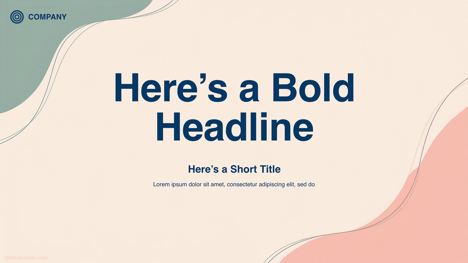
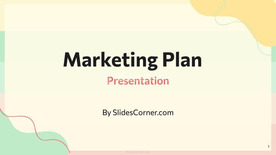
2. The Art of Choosing a Marketing Presentation Background
A presentation background isn’t a wallpaper — it’s a framework that supports your message.
2.1. Match the Background to Your Objective
| Presentation Type | Best Background Style |
|---|---|
| Brand Launch | Bold gradients, dynamic visuals |
| Quarterly Report | Clean, light, minimal background |
| Creative Pitch | Textured or illustrated designs |
| Corporate Meeting | Professional flat design, blue tones |
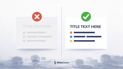
2.2. Contrast is Key
Ensure your text contrasts strongly with your background.
- Dark text on light backgrounds = clean and readable.
- Light text on dark backgrounds = modern and immersive (works best on screens).
Always test slides on different monitors before presenting.
3. Color Psychology in Action: How to Influence Perception
| Color | Emotion | Best Use in Marketing Slides |
|---|---|---|
| Blue | Trust, Reliability | Corporate, finance, B2B |
| Red | Passion, Energy | Retail, sales, call-to-action |
| Green | Growth, Health | Sustainability, startups |
| Yellow | Optimism, Clarity | Creative campaigns |
| Black | Elegance, Power | Luxury brands |
| White | Simplicity, Focus | Tech, education |
| Purple | Innovation, Wisdom | Agencies, beauty |
Pro Tip: Combine emotional colors (e.g., red or yellow) with stabilizing ones (blue or gray) to balance energy and credibility.
You may also like:
The Power of Color: How to Apply Color Theory in Your Presentations
4. Background Types: Which One Fits Your Marketing Story?
4.1. Solid Color Backgrounds
Simple and timeless. Perfect for data-driven decks. Use subtle gradients for depth.


4.2. Textured and Organic Backgrounds
Add a human touch. Textures like paper grain, fabric, or organic lines evoke warmth and authenticity — especially in branding presentations.


4.3. Abstract and Geometric Backgrounds
Modern and visually appealing. Ideal for technology, innovation, and digital marketing themes.


4.4. Photographic Backgrounds
Use with caution. High-quality, semi-transparent photos can create emotional impact — but too much detail distracts.
Best practice: Apply a soft overlay (e.g., black at 20% opacity) to ensure text legibility.
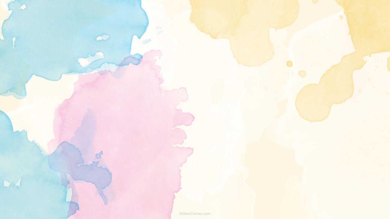
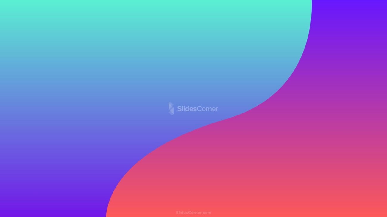
4.5. Gradient Backgrounds
One of 2026’s biggest trends. Gradients bring vibrancy and depth without overwhelming the audience.


5. 2026 Design Trends for Marketing Presentation Backgrounds
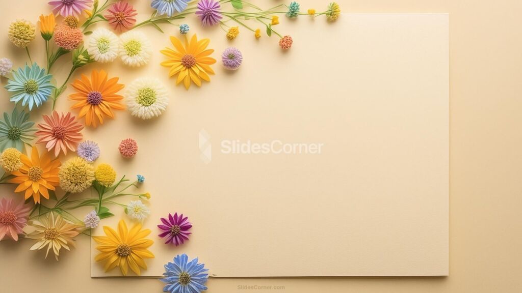
5.1. Pastel and Muted Palettes
Soft, desaturated tones reflect calm confidence — perfect for hybrid work environments and digital-first companies.


5.2. Organic Shapes and Lines
Fluid, curved shapes convey approachability and innovation. These are replacing rigid geometric layouts.


5.3. Semi-Transparent Layers
Overlaying translucent shapes over photos creates a professional, futuristic look.
5.4. AI-Generated Visuals
In 2026, AI tools like DALL·E and Midjourney are helping designers create custom backgrounds that align perfectly with brand identity.
5.5. Eco-Inspired Aesthetics
Natural textures, leaf motifs, and earthy palettes communicate sustainability and corporate responsibility — values that audiences increasingly expect.


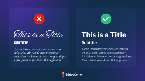
6. The Role of Typography and Icons
Your background should complement, not compete with, typography.
- Sans-serif fonts (like Montserrat or Open Sans) work best for marketing slides.
- Maintain at least 5:1 contrast ratio between text and background.
- Avoid decorative fonts over textured or photographic backgrounds.
Use consistent icon styles (outline or filled) to create visual harmony.
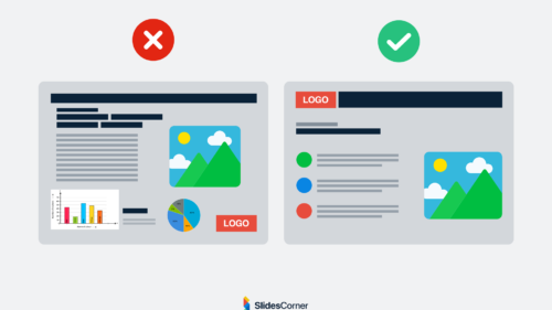
7. Layout Harmony: How Backgrounds Shape Visual Flow
7.1. The Rule of Thirds
Place key elements (titles, graphs, or logos) along imaginary gridlines that divide the slide into thirds. This creates balance.
7.2. White Space is Power
Don’t fear empty space. A background that “breathes” helps highlight what matters.
7.3. Align with Brand Identity
If your brand uses specific colors or shapes (e.g., circles for unity, lines for progress), subtly integrate them into the background for coherence.
8. Common Mistakes to Avoid
- ❌ Overusing stock images — they look generic and harm credibility.
- ❌ Low contrast — unreadable text kills engagement.
- ❌ Inconsistent design — switching background styles mid-presentation breaks flow.
- ❌ Overly busy designs — distract rather than support.
- ❌ Ignoring accessibility — ensure color contrast works for all viewers, including those with color blindness.
“If everything stands out, nothing stands out.” — Edward Tufte
9. Visual Data: Integrating Backgrounds with Charts and Graphs
Your background should enhance your data story, not obscure it.
- Use neutral backgrounds for dashboards and KPIs.
- Highlight key metrics with accent color overlays.
- Keep chart areas transparent or boxed to ensure clarity.
- For infographics, use gradients that subtly guide the viewer’s eye.
10. Choosing Backgrounds for PowerPoint vs. Google Slides
| Platform | Recommended Format | Tip |
|---|---|---|
| PowerPoint | JPG, PNG, or gradient fills | Adjust background transparency via Format Background. |
| Google Slides | Custom image or theme color | Use “Theme builder” to set brand-consistent backgrounds. |
Always export your final deck in 16:9 ratio, optimized for digital screens.
11. Technical Best Practices
- Resolution: 1920×1080 px for full HD presentations.
- File size: Keep backgrounds under 500 KB for smooth performance.
- Format: PNG for transparency, JPG for lightweight slides.
- Consistency: Use the same background across all slides to maintain visual flow.
12. How to Test Your Background’s Impact
Step 1: Show your slides to a colleague and ask what they remember after 10 seconds.
Step 2: View slides on different screens and lighting conditions.
Step 3: Use A/B testing for sales presentations — track audience engagement or conversion rate per design.
Tools to test:
- Google Slides analytics (audience engagement)
- PowerPoint Presenter Coach
- AI tools like Gamma or Tome for real-time feedback
13. Real-World Examples
Tech Startup Pitch
- Gradient background from navy to turquoise.
- Minimal icons and geometric overlays.
- Strong contrast with white typography.
Marketing Agency Proposal
- Pastel beige background with soft organic lines.
- Coral accents highlight KPIs and quotes.
- Flat illustrations for creativity.
Corporate Report
- Simple white background with brand-colored header.
- Blue and gray palette for credibility.
- Charts framed with subtle shadow boxes.
14. Expert Insights: The Power of Visual Consistency
“In a world of endless slides, the most successful presentations are not the loudest — they’re the most coherent.”
— Sophie Lang, Creative Director at SlideStudio
A cohesive background strategy ensures every slide feels part of a single story. In marketing, that consistency equals professionalism — and professionalism builds trust.
15. Advanced Tip: Using Motion and Dynamic Backgrounds
Subtle motion can add sophistication, especially in digital events or webinars.
- Use looped video backgrounds (e.g., soft gradients moving slowly).
- Avoid fast transitions or high-contrast animations that distract.
PowerPoint 2026 and Google Slides are now incorporating AI motion themes, allowing movement that adapts to your content automatically.
16. Where to Find Free and Premium Marketing Presentation Backgrounds
Free Resources
- Slidesgo — modern, editable templates.
- Canva — customizable backgrounds with brand kits.
- Unsplash — high-quality photos for minimalistic designs.
Premium Options
- Envato Elements — professional background collections.
- SlideModel — corporate and marketing templates.
- Creative Market — AI-generated and artistic designs.
17. Future Outlook: The Evolution of Presentation Backgrounds
By 2026, AI-driven personalization is transforming design. Presentations adapt in real time based on audience reactions, lighting, and even mood detection.
Expect backgrounds that:
- Adjust brightness dynamically.
- Shift color tone to emphasize emotional peaks.
- Integrate brand data automatically through cloud APIs.
Your background will no longer be static — it will interact with your story.
18. Final Checklist: The Perfect Marketing Presentation Background
✅ Matches your brand tone
✅ Reinforces message clarity
✅ Maintains color contrast
✅ Consistent across all slides
✅ Optimized for HD screens
✅ Tested for readability
✅ Emotionally aligned with your goal
Conclusion: Your Background is Your Brand
Your marketing presentation background is the silent foundation of your storytelling.
In 2026, where digital attention spans are shorter than ever, design isn’t just about aesthetics — it’s about persuasion, memory, and emotion.
So the next time you open PowerPoint or Google Slides, remember:
Your words may inform, but your background inspires.