Boost your presentations with 10 expert tips for PowerPoint and Google Slides. Improve visuals, structure, and audience impact.
In today’s information-rich world, creating a visually stunning presentation can be the key to making your message memorable. Whether you’re pitching an idea, teaching a class, or leading a workshop, your design choices have a direct impact on how your audience understands and retains the information.
PowerPoint and Google Slides are two of the most widely used tools for creating presentations. But even with easy-to-use templates, many slideshows fall flat. Why? Because great presentations aren’t just about adding slides—they’re about crafting a story, making it visually compelling, and communicating clearly.
In this guide, you’ll find 10 proven tricks to elevate your slides from average to outstanding, no matter which platform you use.
Start With Visual Design That Supports Your Message
1. Use Simple and Aesthetic Backgrounds
A great background sets the tone for your entire presentation. Instead of cluttered designs or default templates, go for simple, aesthetic slide backgrounds that enhance your content without overwhelming it.
- Choose clean, modern layouts with enough whitespace.
- Use subtle gradients, soft shapes, or pastel tones.
- Match background style with your theme (business, education, creative, etc.).
- Avoid using busy patterns that distract from your message.
Pro Tip: Download free presentation backgrounds designed specifically for PowerPoint and Google Slides to save time and improve your visuals instantly.






2. Stick to a Consistent Color Palette
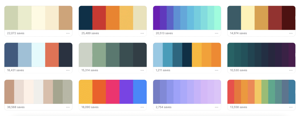
Colors influence perception. A cohesive palette makes your slides look professional and keeps your brand or message consistent.
Related post:
The Power of Color: How to Apply Color Theory in Your Presentations
How to choose:
- Use complementary or analogous colors.
- Limit your color scheme to 3–4 main tones.
- Apply one color for titles, one for body text, and one for highlights.
Online tools like Coolors or Adobe Color can help you generate professional color schemes in seconds.
3. Use Visual Hierarchy to Guide Attention
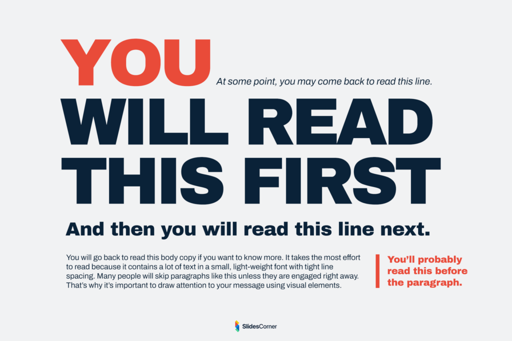
Visual hierarchy helps your audience know what to read first. Emphasize the most important elements using:
- Size: Make key text larger.
- Contrast: Use bold fonts or darker colors.
- Position: Place titles top-left, and visuals center-stage.
This guides your viewer’s eyes naturally through your content.
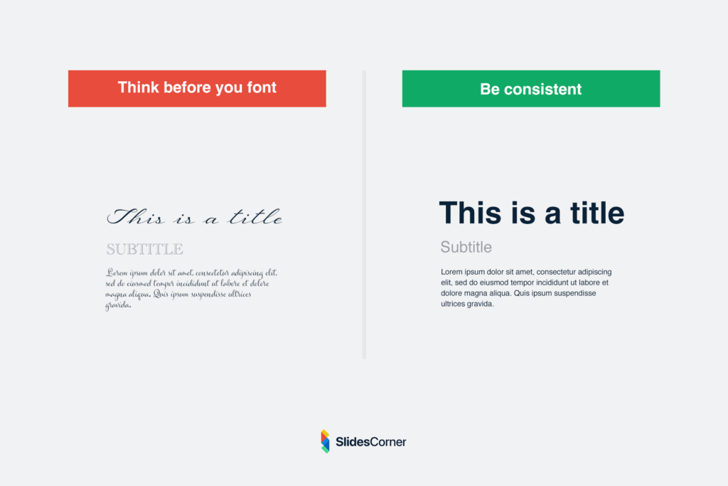
4. Choose Fonts Wisely
Fonts do more than display text—they set the tone.
Tips for font selection:
- Use sans-serif fonts for clean, modern appeal (e.g., Montserrat, Lato, Roboto).
- Avoid script fonts in body text.
- Keep a maximum of two fonts per deck.
- Ensure legibility on large screens or projectors.
Accessibility tip: Use at least 30pt font size for body text and 40pt+ for titles.
Use Structure and Flow to Tell a Compelling Story
5. Apply the 10-20-30 Rule by Guy Kawasaki
A golden rule for impactful presentations:
- 10 slides maximum – concise and clear
- 20 minutes duration – short and effective
- 30-point font minimum – readable from the back row
This rule ensures your audience stays focused and engaged.
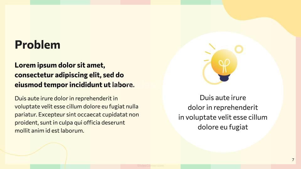
6. Follow the Rule of One Idea Per Slide
Don’t overload your audience with information. Every slide should communicate a single idea. This makes your content easier to digest and more impactful.
Break down complex topics into multiple slides if necessary. Use simple bullet points or diagrams to explain.
7. Use Slide Transitions and Animations Sparingly
While transitions and animations can add flair, overusing them is distracting.
Best practices:
- Stick to one or two types of transitions.
- Use animations only to emphasize (e.g., reveal a key fact).
- Avoid “fun” effects like spins or bounces in professional settings.
Integrate Powerful Visuals and Data Wisely
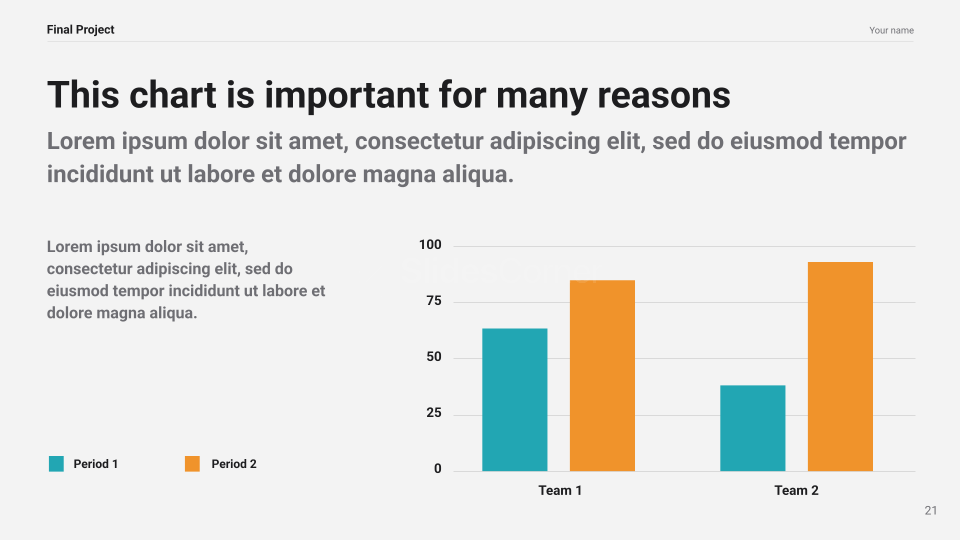
8. Replace Text with Images, Charts, or Icons
Humans process images 60,000 times faster than text. So swap paragraphs for visuals whenever possible.
What to use:
- High-resolution photos
- Custom icons
- Simple charts (bar, pie, line)
- Diagrams or infographics
Use visuals to complement, not duplicate, your message.
9. Use Data Storytelling Techniques
When presenting data:
- Start with a key takeaway (what the data means).
- Use color to highlight trends or differences.
- Animate data step-by-step if presenting live.
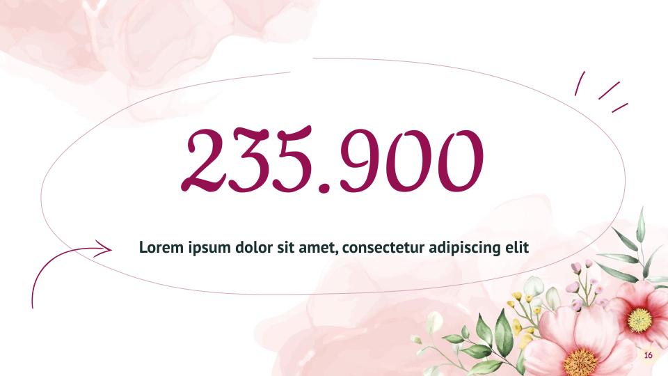
Example: Instead of saying “Sales grew 20%”, show a before-and-after bar chart with color emphasis on the change.
10. Include Visual Callouts and Highlights
Draw attention to key elements using: Callout shapes, Highlighted text boxes, Arrows or lines pointing to data.
This helps guide your viewer’s attention exactly where you want it.
Quick Design Checklist for Google Slides or PowerPoint
Use this checklist before presenting:
- Is the slide background clean and non-distracting?
- Is your font size legible from a distance?
- Are you using a consistent color palette and font?
- Does each slide convey just one message?
- Are visuals aligned and spaced evenly?
- Is the overall flow logical and engaging?
Bonus Tips for Better Audience Engagement
- Start with a powerful hook (question, stat, story).
- Use interactive elements (polls, clickable links, embedded video).
- Repeat key messages throughout to reinforce.
- End with a strong call to action or final takeaway.
Frequently Asked Questions (FAQs)
What’s the best background for a professional presentation?
Use neutral, minimal backgrounds with soft tones or gradients. Avoid busy patterns or highly saturated colors. A light pastel background with dark text often works best.
How do I choose between PowerPoint and Google Slides?
Choose PowerPoint for advanced animations, transitions, or offline use. Opt for Google Slides when you need collaboration, cloud access, or real-time edits.
How many slides should I include in a 10-minute talk?
Ideally, 1 slide per minute. So a 10-minute presentation = 10 slides. But vary this depending on your pace and content complexity.
Can I use free slide backgrounds legally?
Yes! Just make sure they come from a trusted source that provides royalty-free or commercial-use licensed graphics. Always double-check usage rights.
Design to Communicate, Not Just to Impress
A stunning presentation isn’t about flashy visuals or complicated layouts—it’s about clear communication, visual clarity, and emotional connection. Whether you’re using PowerPoint or Google Slides, these 10 tricks will help you create presentations that stand out and resonate.
Use professional free backgrounds, follow simple design principles, and always focus on your audience’s experience.

