This is a Google Slides and PowerPoint free template designed for aesthetic presentations.
Free 30-slide medicine and wellness presentation template in deep pine and teal. Edit it in PowerPoint or Google Slides.
This template is for the talk where credibility matters more than decoration: a clinic reporting annual outcomes, a public health team explaining a screening program, a nutritionist walking a corporate client through a wellbeing plan, a resident defending a case study on a Tuesday morning. The Medicine and Wellness presentation template is a free, 30-slide deck in 16:9 widescreen, fully editable in PowerPoint (.pptx) and Google Slides, with no watermark on any slide.
What the Medicine and Wellness presentation template is, and who it’s for
The deck runs on a six-color palette built around deep pine (#12292B) and clinical teal (#0E7C7B), with two paper tones — bone (#F3F6F4) and mist (#E4EDE7) — a muted sage (#8FAE9B) for structural detail, and a single warm accent, vital coral (#E2725B). Typography is three Google Fonts working as a team: Fraunces for headlines, IBM Plex Sans for body copy, IBM Plex Mono for eyebrow labels, figures and data.
It suits anyone whose content mixes clinical evidence with human care:
- Hospital and clinic teams presenting quarterly or annual outcomes
- Public health and preventive care campaigns
- Nutrition, physiotherapy, sleep and mental wellbeing programs
- Corporate wellness proposals and employee health plans
- Medical students, residents and CME sessions
- Health startups, telemedicine services and insurer partnership pitches
Why this palette, this type scale and this grid
Health decks usually collapse into one of two clichés — sterile corporate blue on white, or pastel spa gradients that undercut anything clinical you say over them. I built this deck to sit between those, using deep pine instead of pure black as the ink color. Black on a projector crushes into a flat hole and makes long paragraphs feel harsh; pine holds depth in a lit room and reads warmer at 24 point. Clinical teal is the working accent because mid-blue tends to go muddy through cheap projector bulbs, while teal keeps its identity even when the color temperature drifts. Coral appears two or three times in the whole deck, deliberately — it’s the flag for the one number you want people to walk out remembering, and if you use it on every slide it stops flagging anything. Sage handles hairlines, medallion frames and dividers, never body text: against bone its contrast is too low to survive the back row.
The type scale moves in three clear steps rather than a smooth ramp. A small mono eyebrow (“CONTEXT”, “CARE PATHWAY”) sets the category, a Fraunces headline carries the idea, and IBM Plex Sans holds the argument underneath. Three distinct sizes let the eye sort the slide in about half a second, which is roughly all the attention a slide gets before someone starts listening to you again instead of reading. Fraunces has an optical size axis and a slightly editorial warmth, and that warmth is doing real work here — it stops a slide about mortality data from looking like a bank statement. IBM Plex Mono earns its place on the timeline, the Gantt and the statistics slides, where tabular figures need to line up in a column and where mono itself signals “this is data” without a label explaining it.
Margins stay constant across all 30 slides, and there’s a footer strip carrying the running title and the slide number in mono. I left the lower third of the section dividers and the statement slide empty on purpose: that band is where webinar tools and live-stream overlays drop lower-third captions, and on a dense agenda it gives the audience somewhere to rest right after a data-heavy slide.
What’s inside: the 30-slide inventory
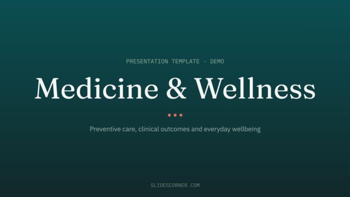
- Slide 1 — Cover. Fraunces headline on deep pine with a dotted accent rule. Title, subtitle, your organization.
- Slide 2 — Contents. Two-column agenda with mono numerals and line icons. Use it when the talk has four or more parts.
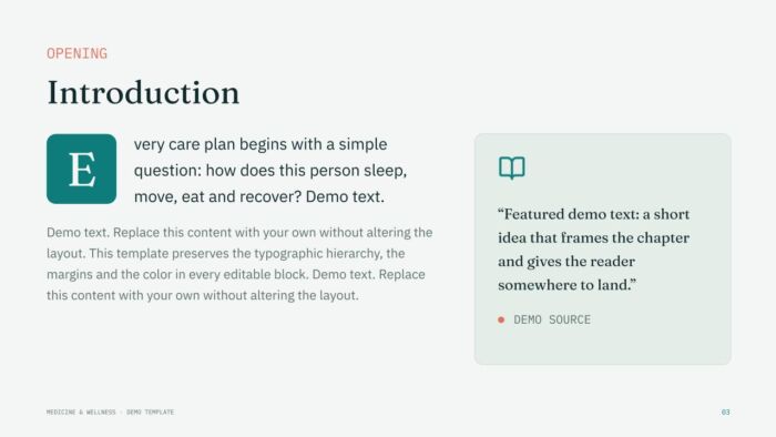
- Slide 3 — Introduction. Running text with an oversized lead-in cap and a side pull-quote card. Good for framing the patient question a program answers.
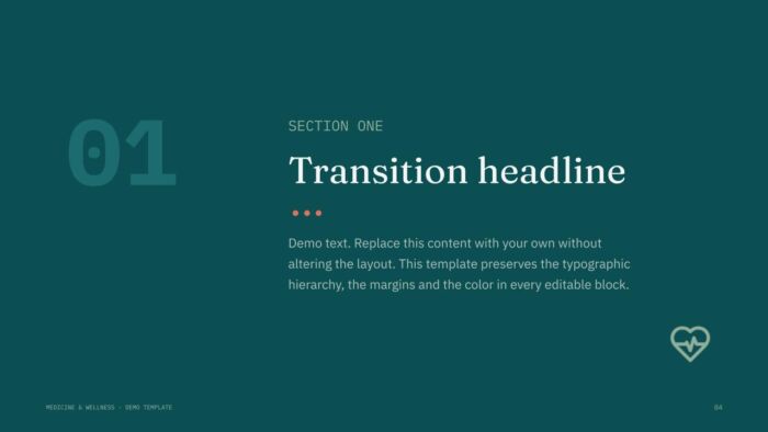
- Slide 4 — Section divider one. Full deep-teal ground with a number and a transition headline.
- Slide 5 — Context with metric. Two columns of text plus a card holding one featured figure. Ideal for a prevalence or adherence rate.
- Slide 6 — The care team. Three profiles in circular medallions with role and contact.
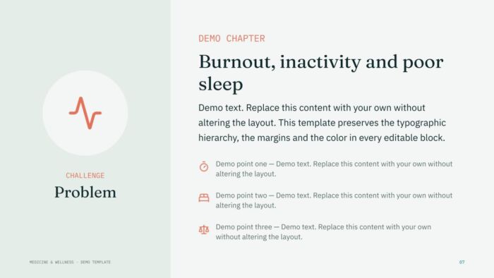
- Slide 7 — Problem. Side panel with a medallion and an icon list, for stating what’s going wrong.
- Slide 8 — Before / After. Split comparison with light and dark halves. Fastest way to show change.
- Slide 9 — Solution. Mirrored version of slide 7, panel on the right, so problem and solution read as a pair.
- Slide 10 — SWOT matrix. Four cards, each with its initial in a rounded tile.
- Slide 11 — Three pillars. Equal columns with icon medallions. Built for Prevent / Treat / Recover style structures.
- Slide 12 — Program list. Numbered items with hairline separators and a supporting icon.
- Slide 13 — Statement slide. One idea at large size, nothing else. Use it once, at the turning point of the talk.
- Slide 14 — Timeline. Horizontal care pathway with milestones alternating above and below the line.
- Slide 15 — Case study. Three process cards: challenge, solution, result.
- Slide 16 — Half-slide image. Full-bleed picture on the left, bulleted findings on the right.
- Slide 17 — Two topics. Two full-height cards on the light ground for side-by-side options.
- Slide 18 — Full-bleed image. Photograph edge to edge with an overprinted headline.
- Slide 19 — Section divider two. Mirrored composition of the first divider, so long decks don’t feel repetitive.
- Slide 20 — Three items. Vertical cards with the icon in a rounded frame.
- Slide 21 — Pull quote. Color panel with a decorative quotation mark and attribution line.
- Slide 22 — Featured figure. One large number plus three secondary data points set in mono.
- Slide 23 — Strategy. Numbered tasks with a headline panel on the right.
- Slide 24 — Gantt chart. Rounded bars over mono month labels, for rollout schedules.
- Slide 25 — Data chart. A native column chart, editable in both PowerPoint and Google Slides.
- Slide 26 — Network map. Map placeholder with numbered pins and a side legend for clinics, labs and centers.
- Slide 27 — Credits. Keep this slide in the file.
- Slide 28 — License. Terms of use.
- Slide 29 — Resources. The exact fonts and the full palette with HEX values.
- Slide 30 — Closing. Thank you, contact line, website.
How to use the Medicine and Wellness template in PowerPoint and Google Slides
In PowerPoint: unzip the download and open the .pptx. Work on the real structure from View > Slide Master — headline sizes, the footer strip and the placeholder positions all live there, so one edit propagates across every slide that uses that layout. Add slides with Home > New Slide > Layout rather than copying and pasting an existing one, which keeps placeholders intact. Delete the layouts you won’t use before you start writing; a 30-slide file trimmed to 14 is much easier to navigate.
In Google Slides: go to File > Open and upload the .pptx, or open the shared version and use File > Make a copy to get your own editable file in Drive. If you’re bringing these layouts into an existing deck, File > Import slides lets you pull in only the ones you need — check “Keep original theme” so the palette and fonts travel with them. The equivalent of the slide master is Slide > Edit theme.
Replacing images without breaking the crop: in PowerPoint, right-click the picture and choose Change Picture, which drops the new file into the same frame; in Google Slides, select the image and use Replace image. Both preserve the placeholder’s aspect ratio. Avoid deleting the placeholder and dragging a photo in from your desktop — that’s what pushes the layout out of alignment on slides 16 and 18.
Changing the colors and fonts in one place
The palette is wired to the file’s theme colors, so you don’t have to recolor shape by shape. In PowerPoint, open Design > Variants > Colors > Customize Colors, swap the hex values, and every card, rule and medallion updates at once. In Google Slides, Slide > Edit theme then the theme color menu does the same job. If your organization has brand colors, the safest move is to replace deep pine with your darkest brand tone and clinical teal with your primary, and leave sage and coral where they are — they’re calibrated as support and accent, and promoting the accent to a main color is what usually makes a deck look loud.
For type, edit Fraunces and IBM Plex Sans in the master rather than slide by slide. If the fonts aren’t installed, install them free from Google Fonts, or substitute: Playfair Display or Georgia for Fraunces, Source Sans 3 or Arial for IBM Plex Sans, Roboto Mono or Consolas for IBM Plex Mono. Substitutions change the texture slightly; keep the size relationships and the deck still holds together.
Legibility, and how not to break the hierarchy
Text below roughly 16 point stops being readable from the back of a typical meeting room, and clinical audiences are exactly the people who will try to squeeze a table in at 11 point. If a slide needs that much detail, split it across two slides or move the table to a handout — the deck has enough layouts to absorb the extra slide without looking padded.
The hierarchy rule is simpler than it sounds: one headline per slide, and never raise body text to headline size to make it feel more important. Emphasis comes from the mono eyebrow, from coral on a single figure, and from white space around the thing that matters. Bolding half a paragraph flattens everything back into a gray block, which is the most common way a good layout gets undone.
FAQ
Is this presentation template free? Yes. The Medicine and Wellness template is a free download from SlidesCorner, with no watermark on any slide.
Does it work in Google Slides? Yes. Upload the .pptx through File > Open, or use File > Make a copy on the Google Slides version. Layouts, theme colors and the native chart all carry over.
Can I change the colors and fonts? Every element is editable. Colors are managed as theme colors, so a single change updates the whole deck, and fonts can be swapped in the slide master or theme editor.
What size are the slides? 16:9 widescreen, 1920 × 1080 px, which is the standard for projectors, video calls and modern displays.
Can I use it for work or client presentations? Do I have to give credit? You can use it for professional and commercial presentations. The license asks you to keep the Credits slide in the file, and it does not allow you to redistribute, resell or sublicense the template, include it in a downloads database, or register it or its elements as a trademark.
Create and edit this Calm Clinical Deck for Health Reports, Patient Programs and Wellness Talks with Google Slides, right in your browser with no special software required. Multiple people can work at the same time, and everyone will always have the latest version. This and creative theme is also available for PowerPoint.
Choose the layout you like from this template, customize the icons, modify the titles of your presentation and highlight the most important content to impress your audience.
To get your viewers's attention you need to create the best presentation possible. With a neat and clear design you will cause a great impact. Use this Medicine and Wellness Presentation Template Free Download to communicate your idea clearly so your audience gets the message quickly and easily. A nice and well designed template like this Calm Clinical Deck for Health Reports, Patient Programs and Wellness Talks will give you the professional image you need for a successful presentation.
- Template 100% editable and easy to modify colors, images and text
- Different slides to impress your audience
- Choose the layout from your theme that best suits your needs
- Template contains maps, tables, graphs and time lines that can be easily edited
- Includes free icons to enhance your presentation
- This theme was designed to be used in Google Slides and Microsoft PowerPoint
- 16:9 widescreen format suitable for all types of screens
- Includes information about fonts, colors, and credits of the free resources used
Download free template
Tags for this theme
About Google Slides and how to get free templates
Google Slides is a very powerful and free tool that has become very popular among educators and business people and you can use it to deliver your presentations. Here you can find completely free Google Slides themes so you can create your presentation like a real pro.
In the last years, Google Slides has evolved including several of the features other presentation tools offered. You can easily access, edit and make presentations on your desktop, tablet or smartphone.
Presentations are easily shared and edited in real time so you can collaborate on your theme at the same time. In this Calm Clinical Deck for Health Reports, Patient Programs and Wellness Talks you can write comments and assign tasks to develop ideas as a team. Learn more about Google Slides here.
You can check our free Google Slides Themes and add them to your Google Drive account. Just go to the Download Theme section.
Google Slides has many benefits for presenters. It encourages teams to collaborate online & real-time, it is free and more.