Discover the best fonts for presentations in 2026 and learn how typography improves clarity in PowerPoint and Google Slides.
Typography is one of the most underestimated elements in presentation design. Many people spend hours choosing backgrounds, colors, and images, yet leave fonts as an afterthought. The result is familiar: slides that technically work but never feel truly professional. Something feels off, even when the content is solid, and that “something” is often typography.
In 2026, typography is no longer just a stylistic decision. It is a functional choice that directly affects readability, authority, and trust. The way text looks on a slide influences how quickly it is read, how easily it is understood, and how credible the message feels. Before your audience reads a single word, they already form an impression based on the typography alone.
Good typography does not draw attention to itself. It disappears into the message and allows ideas to flow naturally. Poor typography, on the other hand, creates friction, slows down reading, tires the eyes, and quietly weakens even the strongest arguments. This article explores why fonts matter more than ever in 2026 and how to choose typefaces that make presentations clearer, calmer, and more professional in both PowerPoint and Google Slides.
Why Typography Matters More in 2026
Presentations today are consumed in far more contexts than ever before. A single deck might be presented in a meeting room, shared as a PDF, viewed on a phone, opened on a tablet, or watched later as part of a recorded video call. Typography must survive all of these scenarios without losing clarity.
In 2026, audiences read slides quickly and often imperfectly. They may be far from the screen, multitasking, or viewing content on small displays. They do not have the patience to decipher decorative fonts or dense text blocks. They expect information to be immediately legible and visually structured.
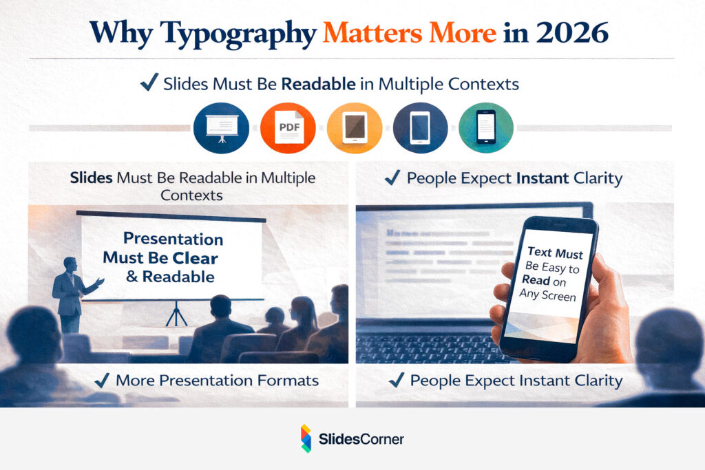
Typography shapes perception faster than content itself. Clean, well-spaced text suggests organization and confidence, while cluttered or outdated fonts signal improvisation and lack of care. This is why typography has become a strategic component of presentation design, rather than a purely aesthetic one. It silently communicates professionalism long before the speaker does.
How the Brain Processes Text on Slides
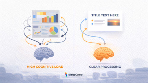
Reading slides is not the same as reading a book or an article. Slides are designed for fast comprehension, not deep reading. The brain does not move line by line; it scans, prioritizes, and filters information almost instantly.
When a slide appears, the eye is drawn first to large elements, strong contrast, and clear shapes. Only afterward does it begin to decode individual words. Fonts that work well in presentations respect this behavior. They have open letterforms, balanced proportions, and consistent stroke widths that remain legible even when projected or resized.
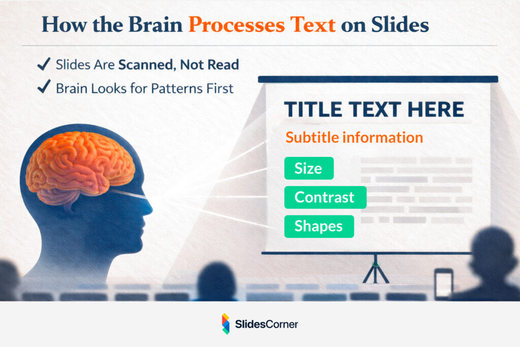
Typography in slides is not about expressing personality or creativity. Its primary job is to remove obstacles between the idea and the viewer. When typography is done correctly, the audience does not notice it at all. They simply understand what is being shown, without effort or hesitation.
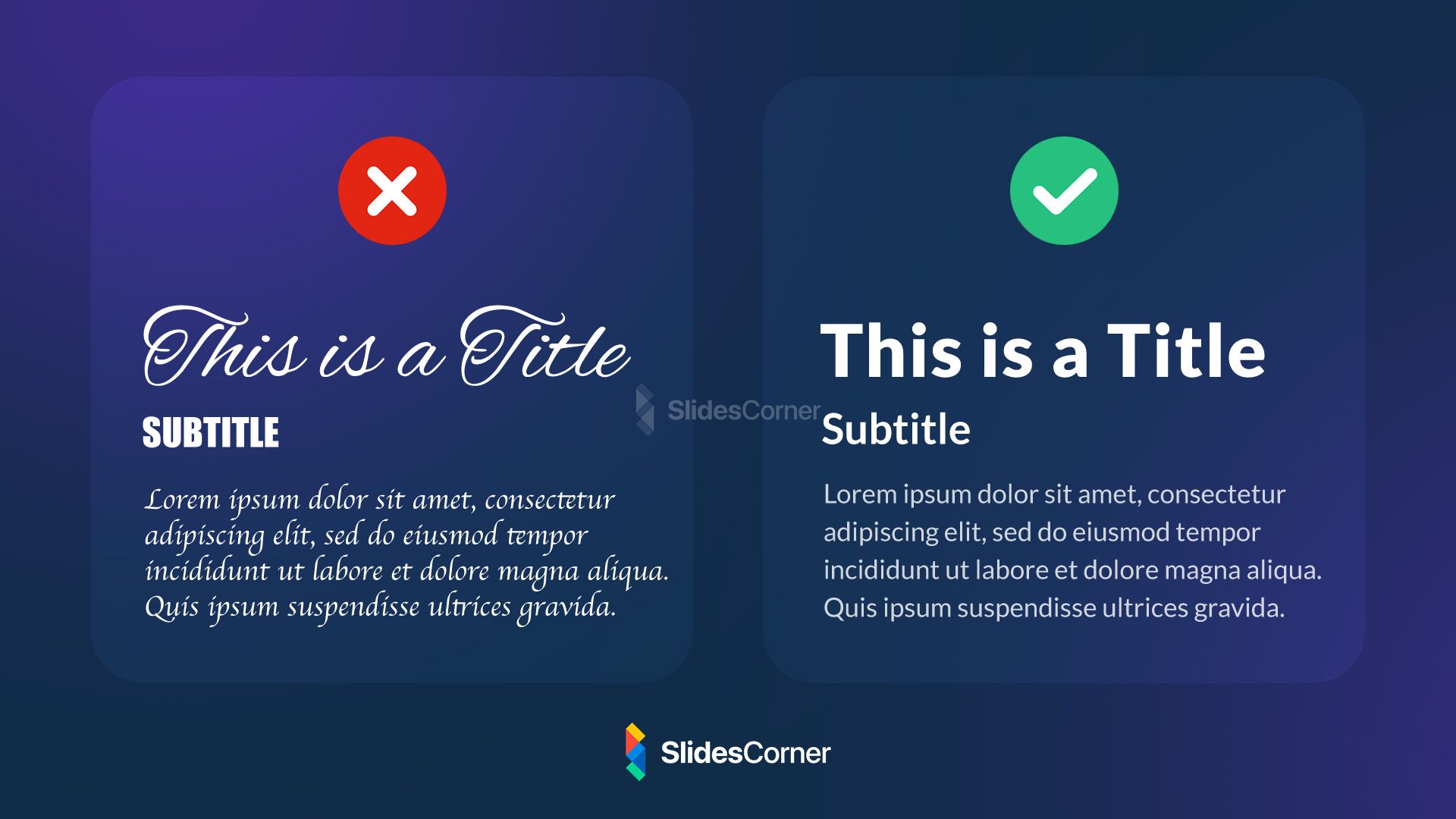
Serif vs Sans Serif in Presentations
For many years, presentation design relied almost exclusively on sans serif fonts, and in 2026 this preference still makes sense in most cases. Sans serif fonts tend to be easier to read on screens, especially at large sizes and from a distance. They feel modern, neutral, and adaptable across industries and contexts.
That said, serif fonts have made a careful and intentional return. When used sparingly, particularly in titles or section headers, serif fonts can add elegance, authority, and editorial character to a presentation. They are especially effective in storytelling-driven decks, creative portfolios, or high-end corporate presentations.
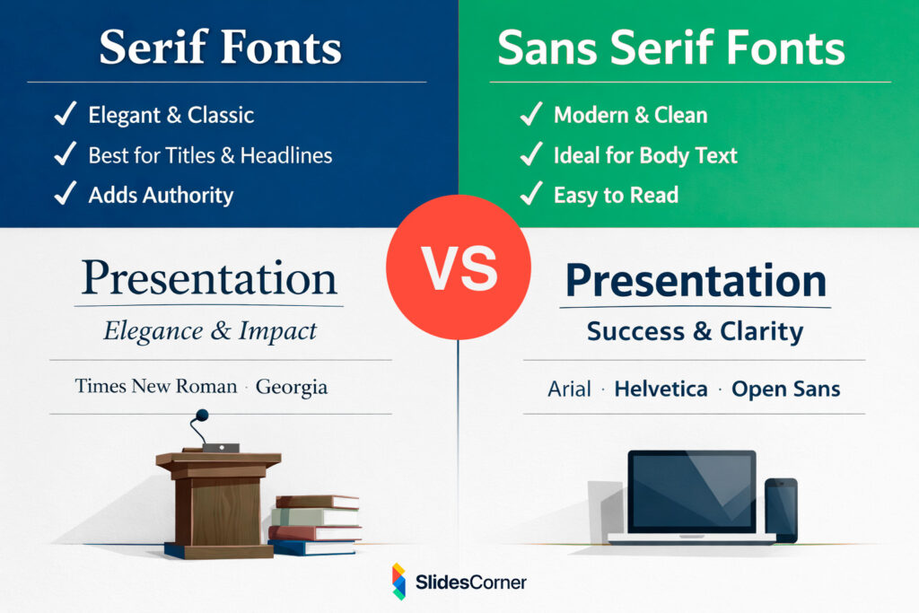
The key is restraint and hierarchy. Mixing serif and sans serif fonts can work beautifully when their roles are clearly defined. Using serif fonts extensively for body text, however, often reduces readability on screens. Successful typography feels inevitable, not clever, and never asks the audience to work harder than necessary.
Font Size and Scale in Modern Slides
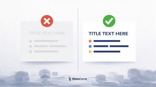
One of the most common typography mistakes in presentations is using text that is too small. Designers often underestimate how far the audience is from the screen or how much clarity is lost through projection, compression, or glare.
In 2026, effective slide typography embraces scale. Titles are bold and clearly dominant. Body text is generous and spaced comfortably. Slides are designed to be read from the back of the room, not just from the presenter’s laptop.
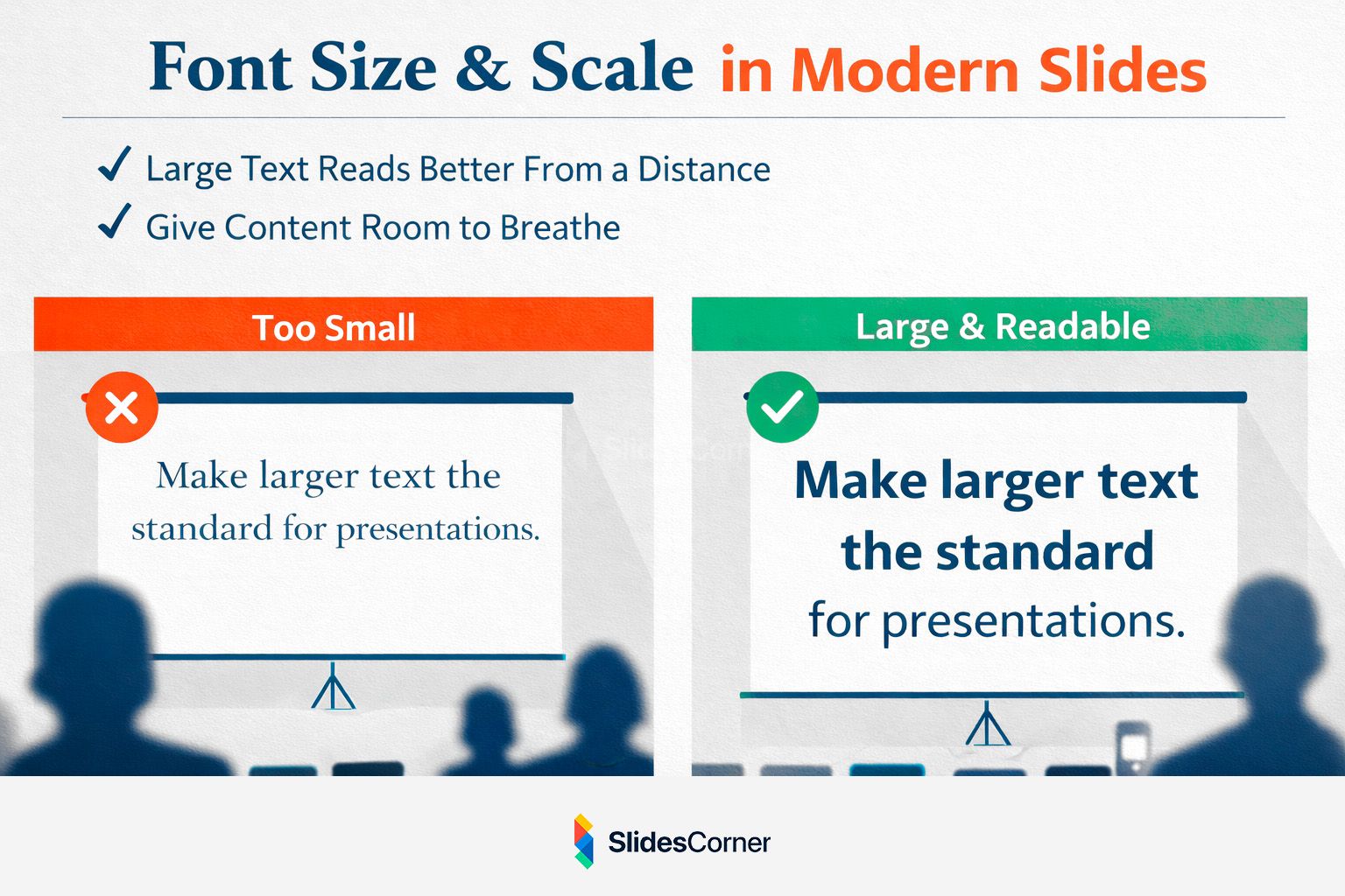
Large text does not mean shouting. It signals confidence and clarity. Slides with fewer words and larger type feel more intentional and easier to follow. Instead of cramming information into a single frame, modern presentations allow ideas to breathe. Typography is no longer about fitting content in; it is about giving content the space it deserves.
Line Length, Spacing, and Visual Rhythm
Typography is not defined solely by the font itself. How text occupies space matters just as much. Long lines of text are harder to read, especially on wide screens, while tight spacing makes slides feel dense and overwhelming.
Readable slides use comfortable line lengths and generous line spacing. They allow the eye to move smoothly from one line to the next without fatigue. This creates visual rhythm, a subtle pacing that mirrors how people naturally speak and listen.
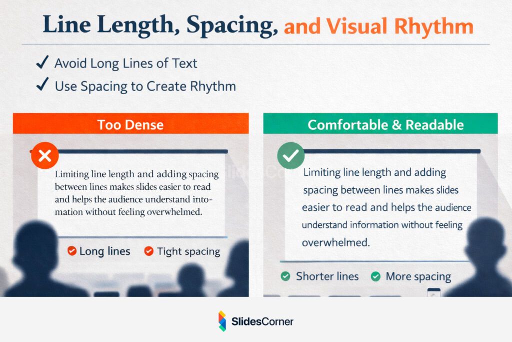
In 2026, many presentations feel calm not because they are minimal, but because their typography is well-spaced and balanced. White space is not empty; it is active. It guides attention, reduces stress, and improves comprehension without adding a single extra element.
Typography and Backgrounds Working Together
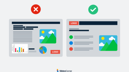
Fonts never exist in isolation. They always live on top of backgrounds, and this relationship directly affects readability. A font that looks excellent on white may fail completely on a textured, colorful, or high-contrast surface.
Professional presentation backgrounds are designed to support typography, not compete with it. They provide stable areas for text, avoid visual noise behind letters, and maintain sufficient contrast across different slides.
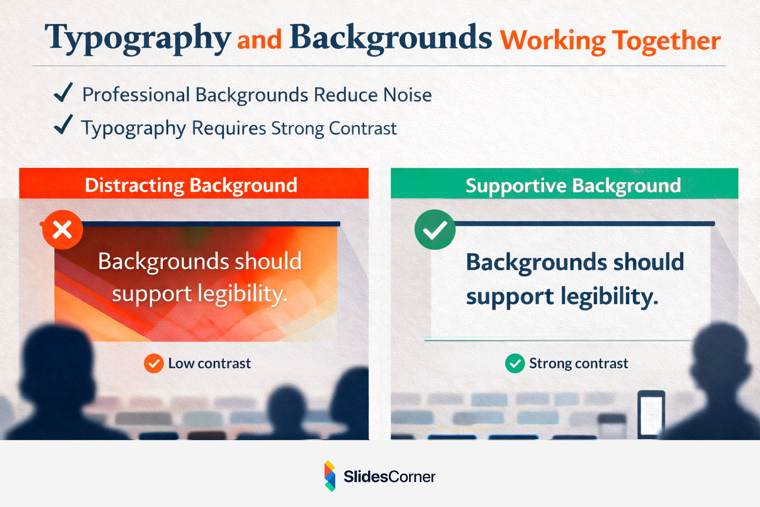
This is why minimalist and abstract backgrounds pair so well with modern fonts. They create a neutral stage where typography can do its job effectively. When background and typography are aligned, slides feel cohesive, intentional, and effortless to read.
Common Typography Mistakes in Presentations
Most typography issues do not come from bad fonts, but from bad decisions. Using too many typefaces, mixing incompatible styles, relying on default spacing, or choosing fonts based on novelty instead of function all reduce clarity.
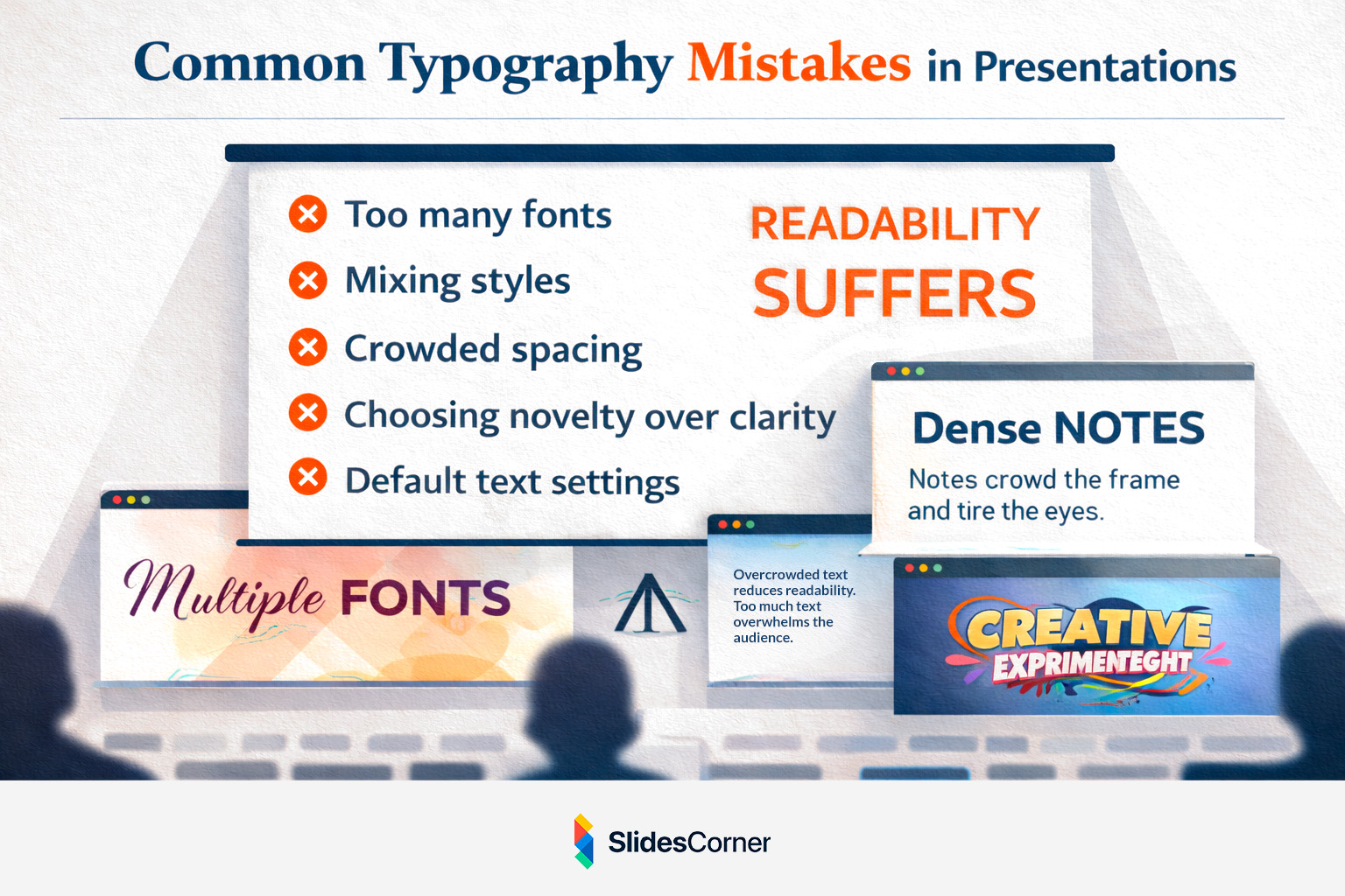
Typography should never compete with content or visuals. Its role is supportive and structural. In 2026, the most professional slides are often the simplest typographically, using one or two well-chosen fonts with clear hierarchy and consistent spacing.
When typography is restrained, the message becomes stronger.
Key Principles for Choosing Presentation Fonts in 2026
- Readable at a distance and on small screens
- Sans serif fonts as the safest choice for body text
- Serif fonts used mainly for titles or accents
- Fewer fonts, stronger hierarchy
- Generous spacing for better comprehension
- Strong contrast at all times
- Typography that feels invisible, not decorative
Questions & Answers
Are default PowerPoint or Google Slides fonts good enough?
Yes. Many default fonts are optimized for screens and presentations. Consistency and clarity matter more than originality.
Should I use custom fonts in presentations?
Only if you are certain they will display correctly across devices and platforms. System-safe fonts reduce technical risk.
Is it okay to use bold text frequently?
Bold works best when used intentionally. Overusing it reduces its impact and weakens hierarchy.
Do fonts affect how professional a presentation feels?
Absolutely. Typography shapes first impressions before the content is even processed.
Can good typography replace good content?
No, but poor typography can easily undermine strong content.
In 2026, strong presentation design is not about visual tricks or trends. It is about clarity, restraint, and intention. Typography sits at the center of that balance.
When your fonts are chosen with care, your slides become easier to read, easier to follow, and easier to trust. And that is exactly what a professional presentation should achieve.