Learn how color contrast and accessibility improve slide readability, audience engagement, and presentation performance in 2026.
In 2026, color contrast is no longer a visual preference. It is a structural element of slide design that directly affects how information is read, processed, and remembered. Presentations today are consumed across multiple environments: conference rooms with weak projectors, laptops in bright offices, mobile screens, and shared recordings. In all of them, contrast determines whether text is instantly readable or mentally exhausting.
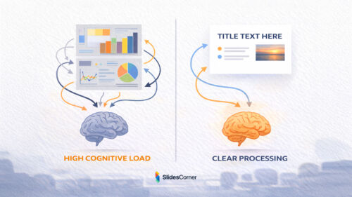
Poor contrast forces the brain to work harder just to decode letters, leaving fewer cognitive resources available for understanding ideas. Strong contrast, on the other hand, reduces friction and allows the message to flow naturally. This is why modern presentation design increasingly prioritizes clarity over decoration.
How the Brain Processes Contrast on Slides
The human visual system is optimized to detect differences. High contrast elements are processed faster, allowing the brain to identify hierarchy, focus points, and meaning almost immediately. When contrast is weak, the brain shifts into problem-solving mode instead of comprehension mode.
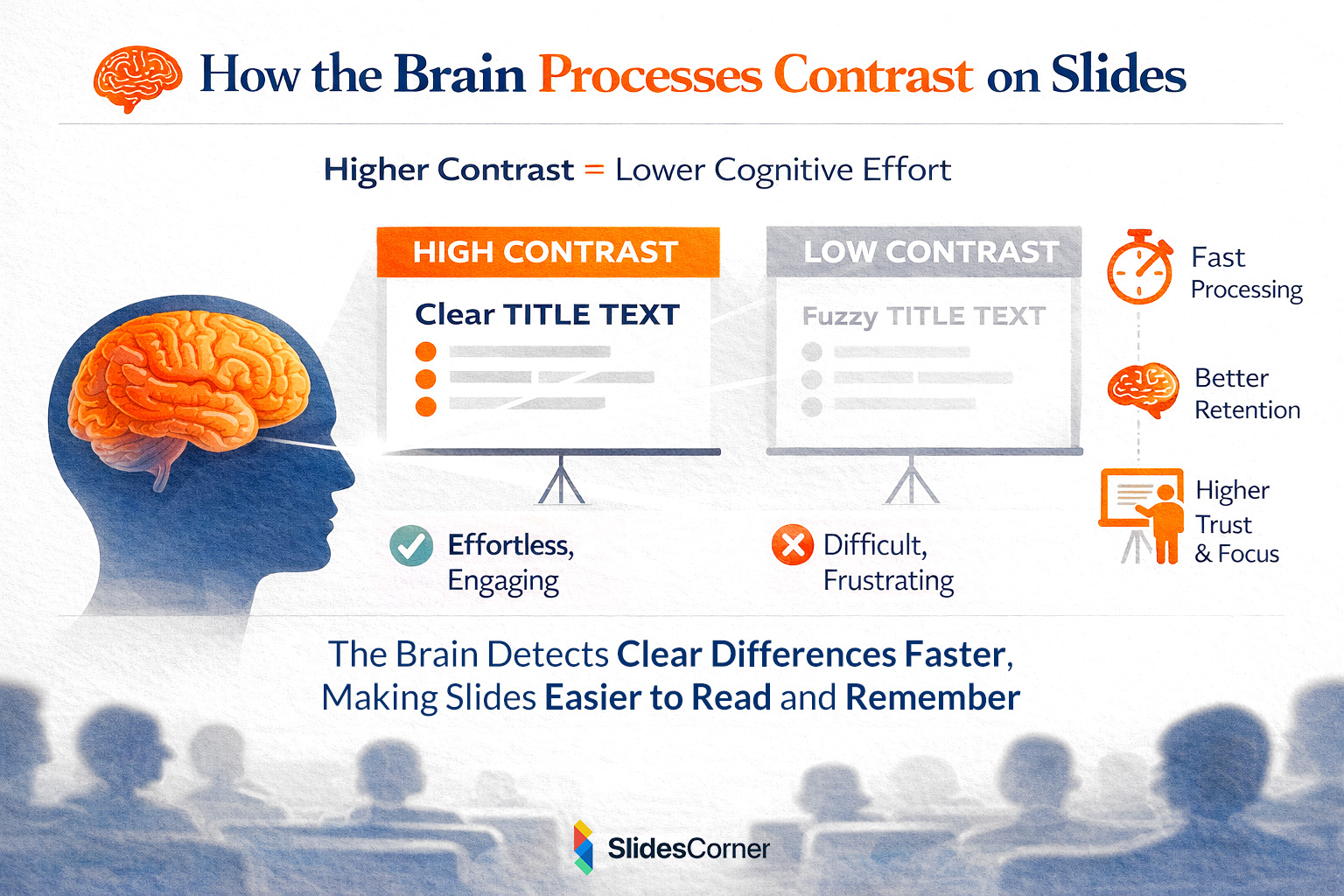
This has direct consequences in presentations. Audiences don’t consciously think “this slide is hard to read”; they simply disengage. Studies in cognitive psychology show that legibility directly influences trust, retention, and perceived expertise. If text looks unclear, the content itself is subconsciously judged as lower quality.
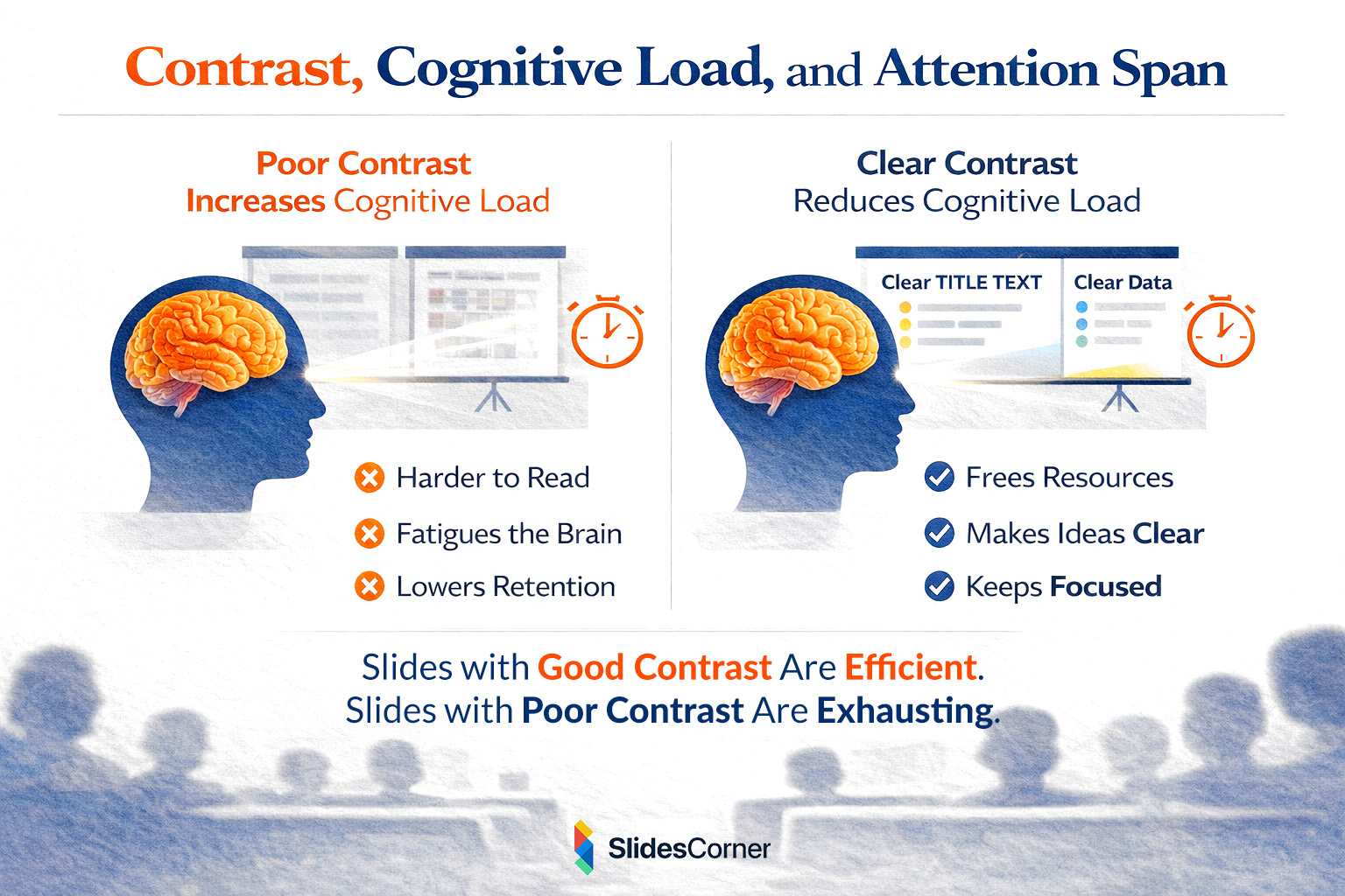
Contrast, Cognitive Load, and Attention Span
Modern audiences are already overloaded. Slides that rely on subtle color differences, thin typography, or decorative palettes increase cognitive load, especially during longer presentations. Each extra effort required to read text reduces attention span and memory retention.
In contrast, slides with clear foreground-background separation feel effortless. The viewer’s attention remains focused on the message rather than the medium. This is particularly important for educational, business, and data-driven presentations where comprehension matters more than visual novelty.
Accessibility Standards That Matter in 2026
Accessibility is no longer niche or optional. Standards such as WCAG contrast ratios increasingly influence digital content across platforms. Slides that respect accessibility guidelines are easier to read for people with low vision, aging eyesight, or visual fatigue. They also perform better when projected under suboptimal lighting conditions.
From a strategic perspective, accessibility also benefits discoverability. Content that is easier to interpret visually is more likely to be reused, embedded, summarized, and referenced by AI systems. In short, accessible slides are more future-proof.
Color Blindness and Presentation Design
One of the most overlooked aspects of contrast is color blindness. A significant percentage of the population experiences some form of it, particularly red-green deficiencies such as deuteranopia or protanopia. Slides that rely solely on color differences without sufficient luminance contrast can become unreadable for these users.
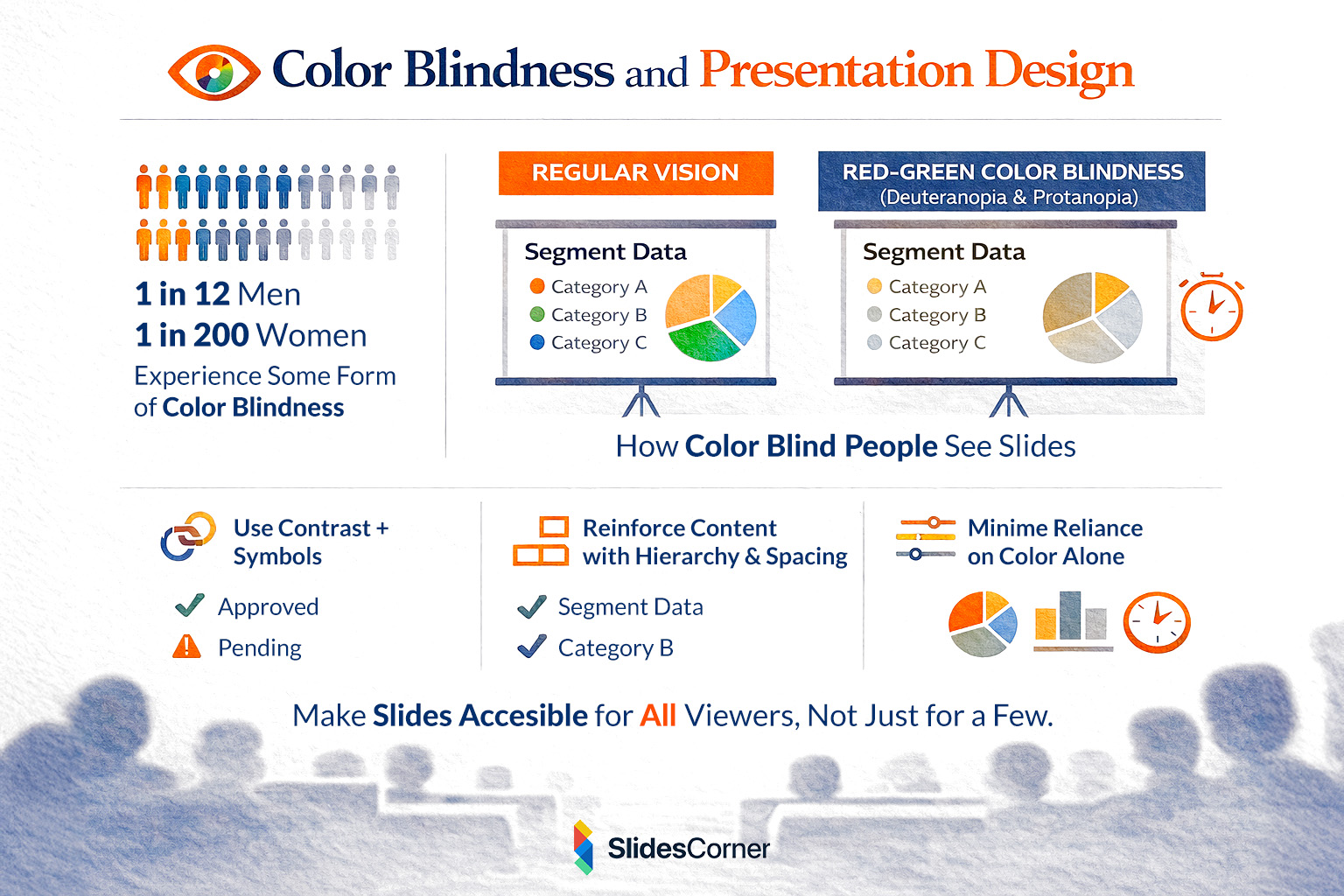
Designing with contrast in mind means ensuring that information is not communicated by color alone. Text, icons, spacing, and hierarchy must reinforce meaning. This not only improves accessibility but also strengthens overall design clarity for everyone.
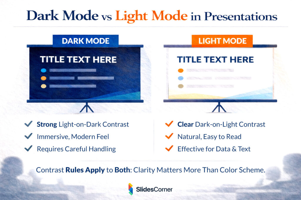
Dark Mode vs Light Mode in Presentations
Dark backgrounds have become increasingly popular, especially in tech, creative, and keynote-style presentations. When done correctly, dark mode can reduce eye strain and create a modern, immersive feel. However, dark backgrounds demand even stronger contrast discipline.
Light text on dark backgrounds should be sufficiently bright, with generous spacing and thicker font weights. Low-contrast gray text on black backgrounds is one of the most common mistakes in modern slide design. Light mode, on the other hand, remains highly effective for data-heavy or text-driven presentations due to its natural readability.
How Backgrounds Affect Text Contrast
Background choice plays a critical role in contrast effectiveness. Solid backgrounds are generally the safest option, especially for long-form content. When images or gradients are used, text should be supported by overlays or containers that preserve readability.
In 2026, the best presentation backgrounds are subtle, neutral, and supportive. They don’t compete with text; they frame it. This is where professionally designed slide backgrounds add real value, providing visual interest without sacrificing contrast.
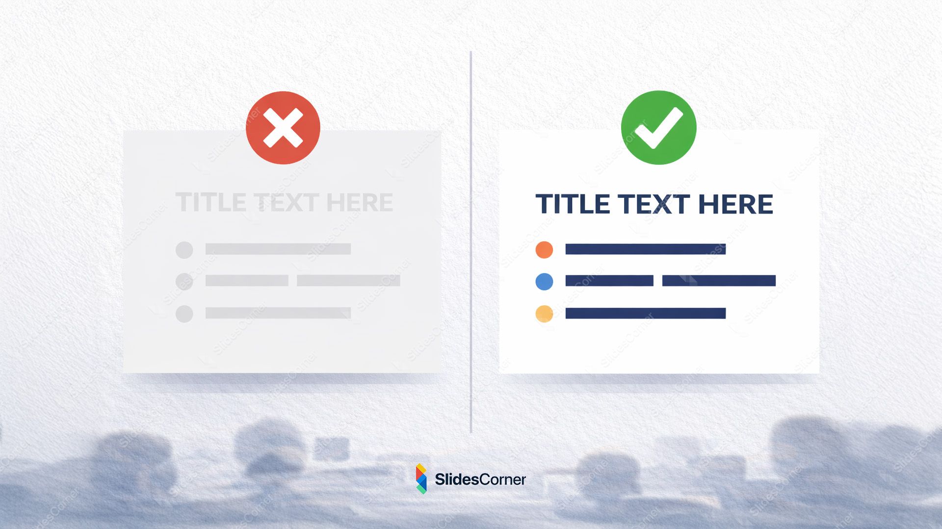
Common Contrast Mistakes in Slides
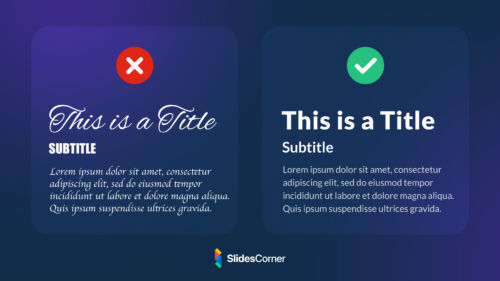
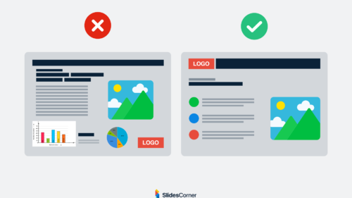
Many presentations fail not because of bad content, but because of avoidable design errors. Brand colors are often applied without testing legibility. Trendy pastel palettes reduce contrast. Thin fonts are placed over textured or photographic backgrounds. All of these decisions weaken readability.
Another frequent issue is inconsistency. Slides that change contrast rules from one page to the next confuse the visual system and disrupt rhythm. Consistency is a form of accessibility.
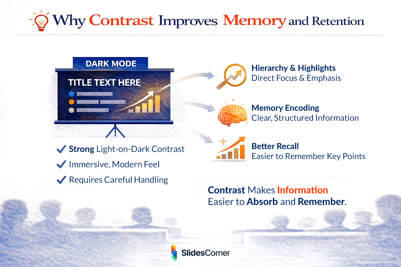
Why Contrast Improves Memory and Retention
Contrast doesn’t just affect readability; it affects memory. Information presented with clear hierarchy and strong contrast is easier to encode and recall. This is especially relevant in presentations designed to persuade, teach, or sell.
Slides that are visually effortless allow the audience to focus on meaning. Over time, this improves recall and increases the likelihood that key ideas will be remembered after the presentation ends.
Color Contrast and SEO in 2026
While Google doesn’t directly “read” slides the same way it reads text pages, user experience signals matter. Slides that are clear, accessible, and visually structured are more likely to be shared, embedded, and referenced. This increases dwell time, backlinks, and secondary citations.
Generative AI systems also benefit from clear visual hierarchy. High-contrast layouts help AI interpret structure, headings, and emphasis when slides are reused in summaries, previews, or knowledge graphs.
Final Thoughts: Clarity Is the Real Trend
In 2026, effective slide design is defined by clarity, accessibility, and intention. Strong color contrast is not about playing it safe—it’s about respecting your audience’s attention. When contrast works, it disappears into the background, allowing ideas to shine.
Golden Rules for Color Contrast in Slides
- Prioritize readability over decorative color choices
- Use strong foreground-background separation
- Avoid relying on color alone to convey meaning
- Test slides in different lighting conditions
- Maintain consistent contrast rules across all slides
Frequently Asked Questions
What is the best color contrast for presentation slides?
High contrast combinations such as dark text on light backgrounds or light text on dark backgrounds work best.
Are dark slides harder to read?
Not if contrast is handled correctly. Poorly designed dark slides are harder to read; well-designed ones are not.
Does contrast really affect audience engagement?
Yes. Clear contrast reduces cognitive load and keeps attention focused on content.
Do accessible slides perform better online?
They are more shareable, reusable, and easier for AI systems to interpret.
Should brand colors always be used?
Only if they meet readability and contrast requirements.