
Discover why minimalist slides improve clarity, focus, and audience engagement. Learn how simple design makes presentations more effective.
Why Minimalism Is Transforming Presentation Design
In the last decade, presentation design has undergone a quiet but powerful transformation. Where slides once overflowed with bullet points, dense paragraphs, and decorative graphics, modern presentations increasingly favor a cleaner and simpler approach. This shift is not merely aesthetic. It reflects a deeper understanding of how people process visual information and how communication works in a digital environment.
Minimalism in slide design is not about removing content for the sake of style. Instead, it is about prioritizing clarity, focus, and cognitive efficiency. A minimalist slide eliminates unnecessary visual noise so the audience can immediately understand the message. When a presentation is designed with simplicity in mind, viewers spend less time deciphering the slide and more time engaging with the ideas being presented.
The growing popularity of minimalist slides also reflects the realities of modern audiences. Today’s viewers consume information across multiple devices, from large conference screens to laptops and mobile displays. Slides that rely on clean layouts, strong contrast, and focused content are far more adaptable and readable across these contexts.
In 2026, minimalist presentation design has become one of the most effective strategies for communicating ideas. Whether you are presenting business data, teaching a class, pitching a product, or sharing research, simpler slides consistently outperform cluttered ones in terms of attention, comprehension, and retention.
What Minimalism Really Means in Presentation Design
Many people assume that minimalism simply means “using fewer elements.” While this is partly true, minimalist design is better understood as a strategic reduction of unnecessary visual information. The goal is not emptiness, but clarity.
A minimalist slide focuses on one primary message at a time. Instead of overwhelming the audience with multiple competing ideas, the slide supports the speaker by highlighting the most important concept. This approach aligns with how human attention works. When viewers encounter too many visual elements simultaneously, their attention becomes fragmented and comprehension decreases.
Minimalist presentations typically rely on a few key principles. These include generous white space, strong visual hierarchy, restrained color palettes, and clear typography. Together, these elements create slides that are easy to scan and instantly understandable.
White space plays a particularly important role. Contrary to common misconceptions, empty space is not wasted space. It is a powerful design tool that helps separate ideas, guide the eye, and emphasize the most important elements on the slide. When used effectively, white space creates a sense of calm and order that improves visual comprehension.
Another defining characteristic of minimalist slides is the careful selection of visual elements. Every object on the slide should serve a purpose. If an icon, line, or decorative shape does not contribute to understanding the message, it is usually better to remove it.
The Psychology Behind Simple Slides
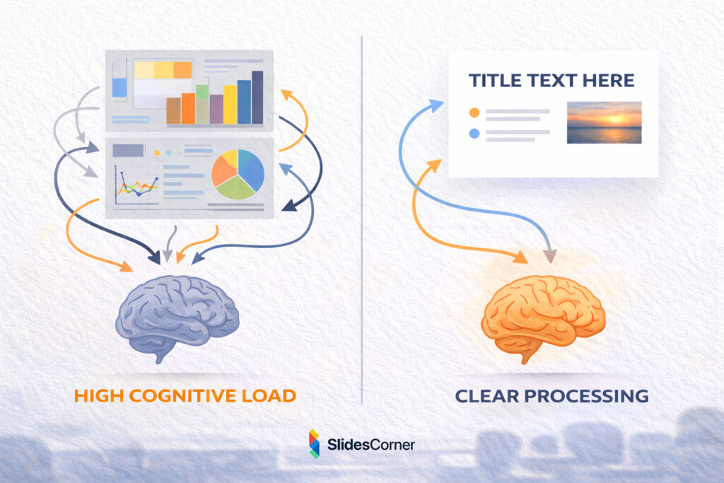
The effectiveness of minimalist presentations is strongly supported by cognitive psychology. The human brain has a limited capacity for processing information at any given moment. When a slide contains too much text, too many images, or too many colors, the viewer’s cognitive load increases dramatically.
Cognitive load refers to the amount of mental effort required to process information. When this load becomes too high, the brain struggles to prioritize information and the message becomes harder to understand. Minimalist design helps reduce cognitive load by presenting information in a structured, visually digestible way.
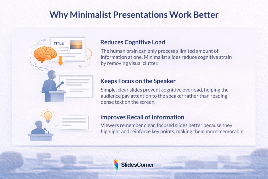
One of the most important benefits of simple slides is that they help the audience focus on the speaker. In presentations filled with text-heavy slides, viewers often stop listening and begin reading instead. This splits attention between two sources of information. Minimalist slides solve this problem by presenting only the key visual cues, allowing the speaker to provide the detailed explanation.
Research in educational psychology also shows that people remember information better when visuals are clear and structured. Slides that highlight a single idea, supported by concise text or a strong visual element, are far more memorable than slides packed with information.
Why Minimalism Works Better on Modern Screens
The shift toward minimalist slide design also reflects the way presentations are viewed today. Audiences are no longer limited to large conference rooms or lecture halls. Presentations are frequently shared online, viewed on laptops, embedded in webinars, or watched on mobile devices.
Slides designed with heavy text blocks often become unreadable when displayed on smaller screens. Minimalist slides, on the other hand, scale much more effectively. Their larger typography, simpler layouts, and stronger contrast make them easier to read across different screen sizes and lighting conditions.
Another factor is attention span. In a world where audiences are constantly exposed to digital content, attention is a scarce resource. Presentations that quickly communicate ideas have a significant advantage. Minimalist slides support this by delivering information quickly and visually, reducing the time required to understand each slide.
Additionally, minimalist presentations align well with modern visual trends. Clean layouts, subtle color palettes, and simple shapes feel contemporary and professional. As a result, minimalist slides often create a stronger first impression than slides that appear visually cluttered or outdated.
The Role of White Space in Minimalist Slides
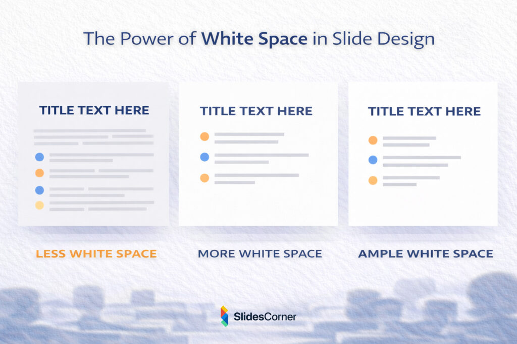
White space, sometimes called negative space, is one of the most powerful elements in minimalist design. It refers to the empty areas surrounding text, images, and other visual components.
Many presenters worry that white space will make their slides look unfinished. In reality, the opposite is true. Properly used white space creates a sense of balance and organization that makes slides easier to read and more visually appealing.
White space helps guide the viewer’s eye through the slide. By separating elements and giving them room to breathe, the design naturally directs attention toward the most important content. This improves both comprehension and visual hierarchy.
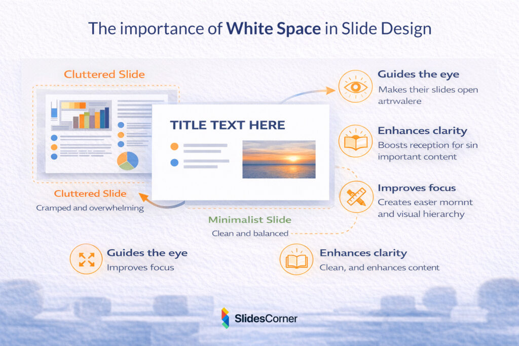
Another benefit of white space is that it enhances contrast and readability. Text placed in crowded environments is harder to read because the surrounding elements compete for attention. When text is surrounded by sufficient empty space, it becomes significantly easier to process.
Minimalist slides often appear calmer and more elegant precisely because they rely on white space as an intentional design element rather than filling every corner of the slide.
Common Mistakes When Trying to Design Minimalist Slides
While minimalist presentation design may appear simple, it requires careful decision-making. Many presenters attempt to simplify their slides but inadvertently create new design problems.
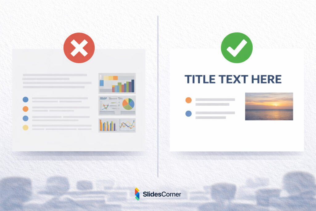
One common mistake is removing too much context. A slide that contains almost no information may look clean, but it can also become confusing if the audience cannot understand its purpose. Minimalism should clarify the message, not obscure it.
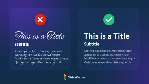
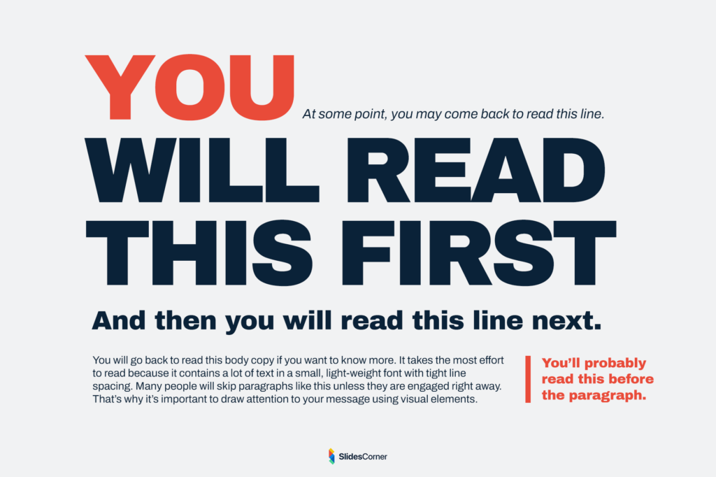
Another frequent issue is poor visual hierarchy. Even minimalist slides need clear structure. If headings, text, and images all appear similar in size or importance, viewers may struggle to identify the main idea.
Color choices can also create problems. Minimalist slides often use fewer colors, but those colors must still provide sufficient contrast. Without strong contrast between text and background, readability suffers significantly.
Typography is another area where mistakes occur. Minimalist design typically relies heavily on text elements, which means font selection, size, and spacing become extremely important. Using fonts that are too thin, too decorative, or too small can undermine the effectiveness of an otherwise simple slide.
Practical Principles for Creating Minimalist Slides
When designing minimalist presentations, it helps to follow a few fundamental guidelines that keep slides clear and visually balanced.
- Focus on one key message per slide
- Use large, readable typography instead of long paragraphs
- Limit the number of colors in your palette
- Leave generous white space around important elements
- Use images or icons only when they support the message
- Maintain consistent alignment and layout across slides
- Ensure strong contrast between text and background
These principles help ensure that simplicity enhances the presentation rather than weakening it.
Why Minimalist Presentations Improve Audience Engagement
One of the biggest advantages of minimalist slide design is its ability to maintain audience engagement. When slides are visually overloaded, viewers quickly lose interest or feel overwhelmed. Simpler slides create a smoother viewing experience that keeps the audience focused on the narrative of the presentation.
Minimalist slides also encourage storytelling. Because the slides contain fewer words, the presenter becomes the primary source of explanation. This allows the presentation to feel more conversational and engaging rather than scripted.
Another benefit is pacing. Slides that contain too much information often slow down presentations because the audience needs time to read them. Minimalist slides move more fluidly, supporting a natural rhythm between visuals and spoken explanation.
The result is a presentation that feels clearer, more confident, and easier to follow.
Why Minimalism Will Continue to Shape Presentation Design
Looking ahead, minimalist design will likely remain one of the dominant trends in presentations. As audiences continue to consume information through digital screens and online platforms, the need for clarity, speed, and visual simplicity will only increase.
Advances in presentation software, design tools, and templates are also making minimalist design easier to achieve. Many modern presentation backgrounds are intentionally designed with clean layouts and subtle visual elements that support simple content.
This shift reflects a broader movement in design culture toward usability and clarity. Rather than competing for attention with complex visuals, effective presentations now aim to guide the audience’s attention with precision.
Minimalism is not just a style. It is a communication strategy that aligns design with the way people actually process information.
Frequently Asked Questions About Minimalist Slide Design
What is a minimalist presentation slide?
A minimalist slide focuses on one key idea using a simple layout, limited text, and clear visual hierarchy. It removes unnecessary elements that distract from the message.
Are minimalist slides better for presentations?
In most cases, yes. Minimalist slides reduce cognitive load, improve readability, and help audiences focus on the speaker and the main idea.
How much text should a minimalist slide contain?
Minimalist slides typically contain short phrases or keywords rather than full paragraphs. The detailed explanation should come from the presenter.
Do minimalist slides look too simple?
When designed properly, minimalist slides appear modern, professional, and elegant. The key is using strong typography, spacing, and contrast.
Can minimalist design work for data-heavy presentations?
Yes. Even complex data can be presented in a minimalist way by breaking information into multiple slides and using clear charts or visual hierarchy.