Stop putting your audience to sleep with boring presentations! Learn how to apply color theory for a more impactful and engaging design.
In the digital age, presentation skills are more important than ever. With countless slideshows, webinars, and virtual meetings happening every day, it’s easy for your message to get lost in the noise. That’s where color theory comes in.
Color theory is the science and art of using color to create a harmonious and impactful visual experience. By understanding how colors interact and how they affect our mood and perception, you can take your presentations from boring to brilliant.
In this article, we’ll explore the basics of color theory and how you can apply it to your presentations to create a lasting impression on your audience. We’ll cover everything from color psychology to color combinations and show you how to use them to create compelling and effective presentations.
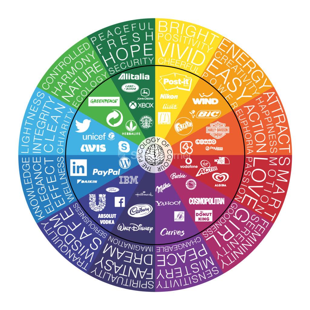
First, we’ll dive into the psychology of color. Did you know that different colors can elicit different emotional responses from your audience? For example, red is often associated with passion and energy, while blue is often associated with calmness and trustworthiness. By understanding the psychological impact of colors, you can use them strategically to enhance your message and connect with your audience on a deeper level.
Next, we’ll explore color combinations. Choosing the right colors can make or break your presentation. We’ll teach you the basics of color harmonies and show you how to create eye-catching color schemes that are both aesthetically pleasing and effective at conveying your message.
We’ll also cover practical tips on how to use color in your presentations, such as how to choose the right font color, how to use color to highlight important information, and how to avoid common mistakes that can detract from your message.
By the end of this article, you’ll have a solid understanding of color theory and how to apply it to your presentations. You’ll be able to create stunning visuals that capture your audience’s attention and leave a lasting impression. So, whether you’re a seasoned presenter or a beginner just starting out, this article is for you. Get ready to take your presentations from boring to brilliant with the power of color theory.
Psychology of Color
Color has a powerful impact on our emotions and perception. Understanding the psychology of color can help you use it to your advantage in your presentations, making them more engaging, memorable, and effective.

Let’s start with red. Red is a high-energy color that is often associated with passion, excitement, and urgency. It can stimulate the senses and increase heart rate and blood pressure. That’s why you’ll often see it used in advertising and marketing to grab people’s attention and create a sense of urgency. However, too much red can be overwhelming and even aggressive, so use it sparingly and strategically.
- Blue: on the other hand, is a calming and trustworthy color. It’s often associated with stability, dependability, and intelligence. Blue can create a sense of trust and reliability, which is why you’ll often see it used in corporate branding and professional settings. However, too much blue can create a sense of coldness and detachment, so be sure to balance it with warmer colors if you want to create a more welcoming atmosphere.

- Green: is a color of growth, balance, and harmony. It’s often associated with nature, health, and wealth. Green can create a sense of relaxation and balance, making it a great choice for presentations on environmental or health-related topics. However, too much green can create a sense of boredom and stagnation, so be sure to add some variety with other colors if you want to keep your audience engaged.

- Yellow: is a bright and cheerful color that is often associated with happiness, optimism, and creativity. It can create a sense of playfulness and positivity, making it a great choice for presentations on topics related to innovation or inspiration. However, too much yellow can be overwhelming and even anxiety-inducing, so use it sparingly and balance it with calmer colors like blue or green.

- Purple: is a color of luxury, creativity, and spirituality. It’s often associated with royalty and extravagance, but it can also create a sense of mystery and intrigue. Purple can be a great choice for presentations on topics related to art, design, or spirituality. However, too much purple can create a sense of aloofness and elitism, so be sure to balance it with other colors if you want to create a more approachable atmosphere.

- Red: is associated with passion, excitement, and urgency. It can also be associated with danger or warning, making it a good choice for alerting your audience to important information. Red can also stimulate appetite, which is why you’ll often see it used in food-related branding and marketing.

- Pink: is a softer, more romantic version of red. It’s often associated with love, sweetness, and femininity. Pink can create a sense of warmth and compassion, making it a good choice for presentations on topics related to relationships or caregiving.

- Light blue: Light blue is a calming and soothing color that is often associated with relaxation, tranquility, and trust. It can create a sense of openness and sincerity, making it a good choice for presentations on topics related to communication or cooperation.

- Orange: is a high-energy color that is often associated with enthusiasm, creativity, and warmth. It can create a sense of excitement and playfulness, making it a good choice for presentations on topics related to entertainment or innovation.

- Brown: Brown is a natural and earthy color that is often associated with stability, reliability, and comfort. It can create a sense of warmth and security, making it a good choice for presentations on topics related to sustainability or home-related topics.

- Black: is a sophisticated and powerful color that is often associated with elegance, luxury, and authority. It can create a sense of formality and seriousness, making it a good choice for presentations on topics related to business or high-end products.

- White: is a clean and pure color that is often associated with simplicity, innocence, and clarity. It can create a sense of openness and purity, making it a good choice for presentations on topics related to healthcare or spirituality.

These are just a few examples of how color can affect our emotions and perception. By understanding the psychology of color, you can use it to your advantage in your presentations, creating a visual experience that not only looks great but also resonates with your audience on a deeper level and create the mood and atmosphere you want. So, choose your colors wisely and get ready to make an impact with the power of color psychology. Remember to balance colors appropriately and use them strategically to enhance your message and connect with your audience on a deeper level.
Color Combinations
Choosing the right color scheme for your presentation can be a daunting task, but it’s essential to creating a cohesive and impactful visual experience for your audience. Here are some tips on how to explore color combinations and choose the right colors for your presentation.
Start with a color wheel
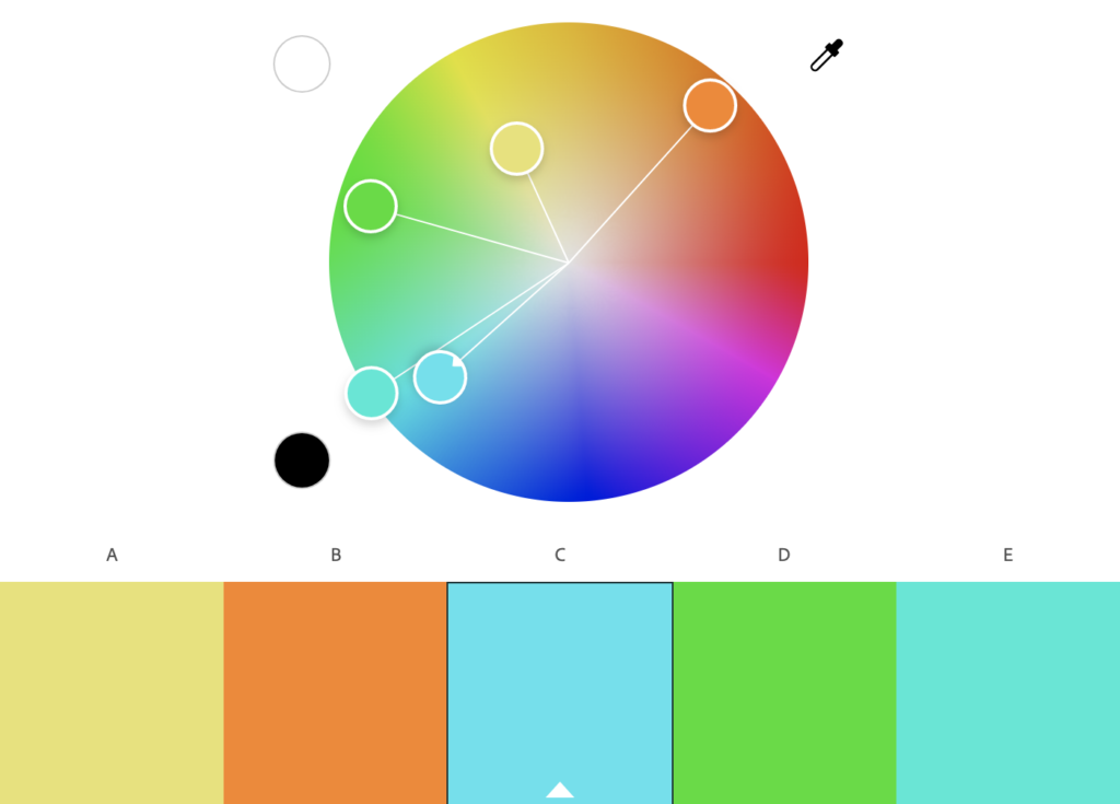
A color wheel is a great tool for exploring color combinations. It shows the relationship between primary, secondary, and tertiary colors and can help you create complementary, analogous, or triadic color schemes. Play around with different combinations to see what works best for your message and brand.
Consider your brand
If you have an established brand, you may want to use your brand colors in your presentation to reinforce brand recognition. If not, consider the values and message of your presentation and choose colors that reflect those. For example, if your presentation is about nature, you may want to use green and earth tones.
Think about the mood
Different colors evoke different emotions and moods. Consider the mood you want to create in your presentation and choose colors that reflect that. For example, if you want to create a calming and peaceful atmosphere, you may want to use light blues or soft pastels.
Use contrast
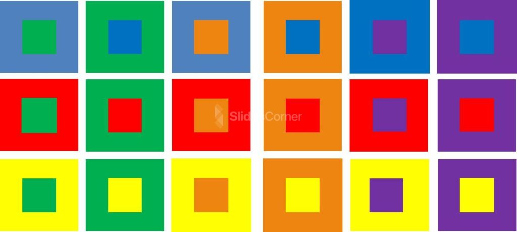
Contrast can make your presentation more visually interesting and help important information stand out. Choose colors that contrast well with each other, such as black and white or red and green. But be careful not to use too many contrasting colors, as it can be overwhelming for your audience.
Keep it simple
Too many colors can be distracting and take away from your message. Stick to a few main colors and use them consistently throughout your presentation. This will create a more cohesive and professional look.
Consider accessibility
It’s important to choose colors that are accessible to all individuals, including those with color blindness. Avoid using color alone to convey important information and use high-contrast color combinations to make it easier for everyone to read and understand.
Test it out
Before your presentation, test out your color scheme on different devices and screens to ensure it looks good in all environments. You can also ask a few colleagues or friends for their feedback on the color scheme and adjust as needed.
In summary, exploring color combinations and choosing the right colors for your presentation takes some thought and consideration. Use a color wheel, consider your brand and the mood you want to create, use contrast, keep it simple, consider accessibility, and test it out. By following these tips, you can create a visually appealing and effective presentation that connects with your audience on a deeper level.
How to Choose the Right Colors for Presentations
Using color effectively in your presentations is an important part of creating a visually engaging and impactful experience for your audience. Here are some practical tips on how to use color in your presentations.
Choose the right font color
Font color is crucial for readability, so it’s important to choose a color that contrasts well with your background. For example, black or dark gray text works well on a light background, while white or light text is better on a dark background. Avoid using light-colored text on a light background or dark-colored text on a dark background, as it can be difficult to read.
Use color to highlight important information
Color can draw attention to important information and help it stand out from the rest of the content. Use a contrasting color to highlight key points, such as statistics or quotes. But be careful not to overdo it, as too much color can be overwhelming and detract from your message.

Create a consistent color scheme
A consistent color scheme can make your presentation look more polished and professional. Choose a few main colors and use them consistently throughout your presentation. This includes font color, background color, and accent colors. Use shades of the same color to create depth and interest.

Avoid common color mistakes
There are a few common mistakes that can detract from your message. For example, using too many bright or clashing colors can be distracting, while using too many pastel or muted colors can be boring. Avoid using neon colors, as they can be difficult to read and can give your presentation an unprofessional look.
Consider cultural differences
Different cultures can associate different meanings with colors. For example, in Western cultures, white is often associated with purity and innocence, while in some Asian cultures, it’s associated with mourning. Be mindful of the cultural context of your audience and choose colors that are appropriate.
Use color in charts and graphs
Charts and graphs can be made more visually appealing and easier to understand by using color to differentiate data sets. Use consistent colors throughout the chart or graph to create a clear visual hierarchy.

In summary, using color effectively in your presentations requires some thought and consideration. Choose the right font color, use color to highlight important information, create a consistent color scheme, avoid common color mistakes, consider cultural differences, and use color in charts and graphs. By following these practical tips, you can create a visually engaging and impactful presentation that resonates with your audience.
Tips and Tricks: How to Make Your Presentation Look Professional
Applying the theory of color to your presentations can take your design game to the next level. Here are some tips on how to apply color theory effectively in your presentations, along with some modern design tips to enhance your visuals.
Understand the basics of color theory
Understanding color theory is essential to using color effectively in your presentations. It’s important to understand the different color schemes, such as complementary, analogous, and monochromatic, and how they can be used to create visual interest and harmony. Additionally, knowing the emotions and associations that are commonly associated with certain colors can help you create a mood or convey a message.
Choose a color palette
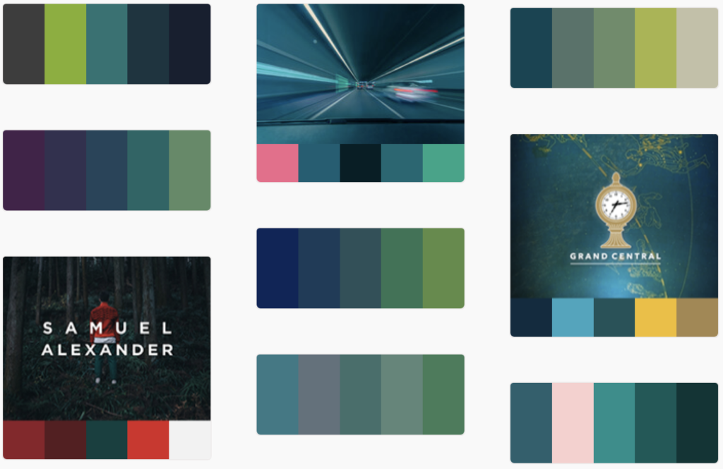
Once you have a basic understanding of color theory, it’s time to choose a color palette for your presentation. You can choose a color palette based on your brand colors, the theme of your presentation, or the emotions you want to evoke. Stick to a limited color palette to keep your design cohesive and avoid overwhelming your audience.
Create visual interest with contrast
Contrast is important for creating visual interest and directing the viewer’s attention. Use contrasting colors to create a hierarchy of information and draw attention to important elements. This can include using a bright color for headings or important text, or using a contrasting color for buttons or calls to action.
Use color blocking
Color blocking is a modern design trend that involves using large areas of color to create a bold and impactful design. Use color blocking to create a strong visual hierarchy and make important information stand out. For example, you can use a bright color for the background of a slide and use a contrasting color for the text.

Consider typography
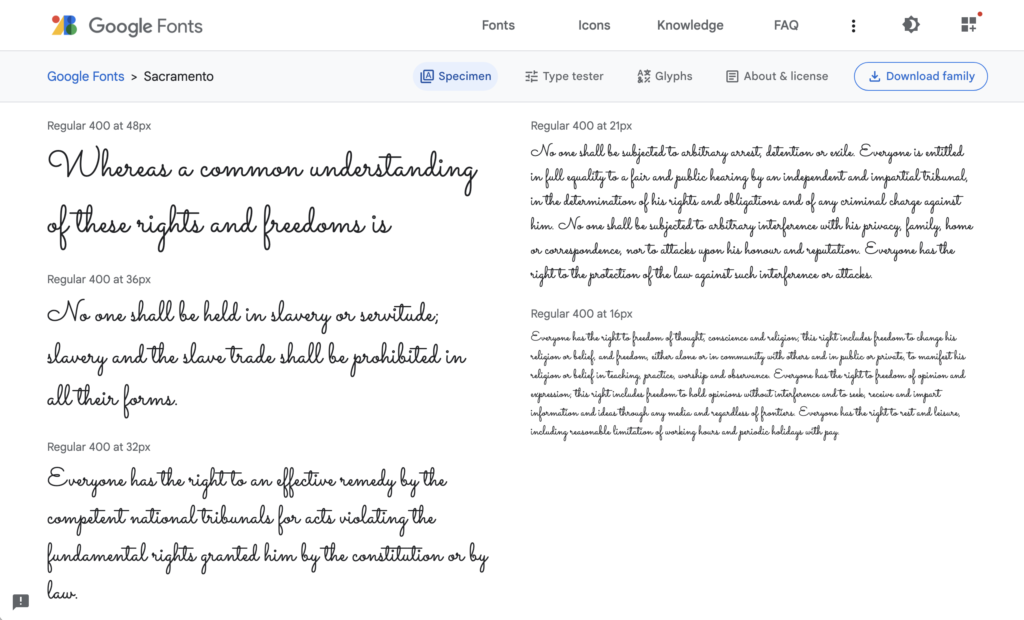
Typography is an important part of design, and it’s essential to consider the relationship between your font and your color palette. Choose fonts that complement your color palette and create a harmonious design. Use a bold font for headings and a more subtle font for body text. You can use a free tool like Google Fonts to search for the right font.
Add texture
Texture can add depth and interest to your design, and it can be achieved through the use of patterns or images. Use texture sparingly, as too much can be overwhelming. Consider using texture to add visual interest to backgrounds or to create contrast between different elements. Also, you can use our free backgrounds to enhance your slides.

In conclusion, applying the theory of color to your presentations requires a basic understanding of color theory, the ability to choose a color palette, creating contrast, using color blocking, considering typography, and adding texture. By following these tips, you can create a visually engaging and modern design that effectively communicates your message to your audience.

